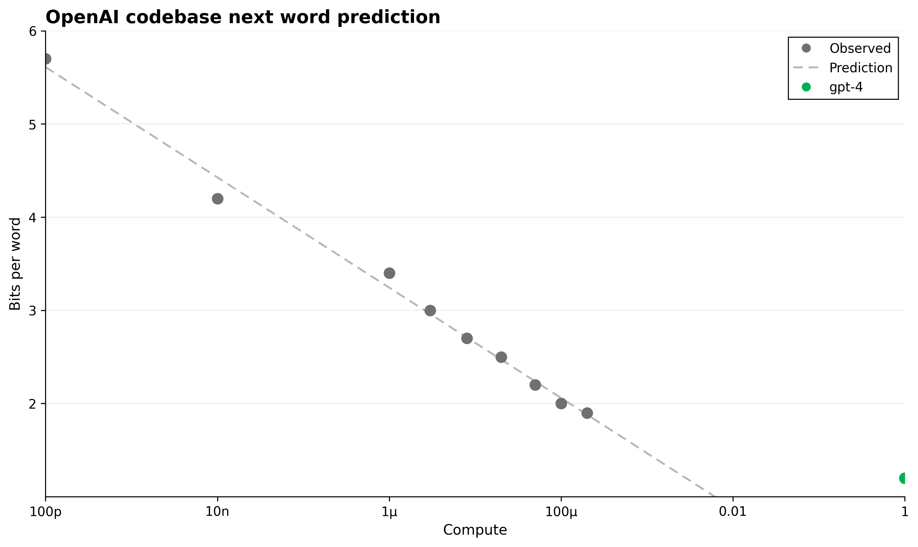
OpenAI codebase next word prediction
This figure shows the bits per word metric versus compute scale for next word prediction on the OpenAI codebase. It includes observed data points as gray dots, a prediction curve as a dashed line, and a single green dot representing the gpt-4 model's performance.
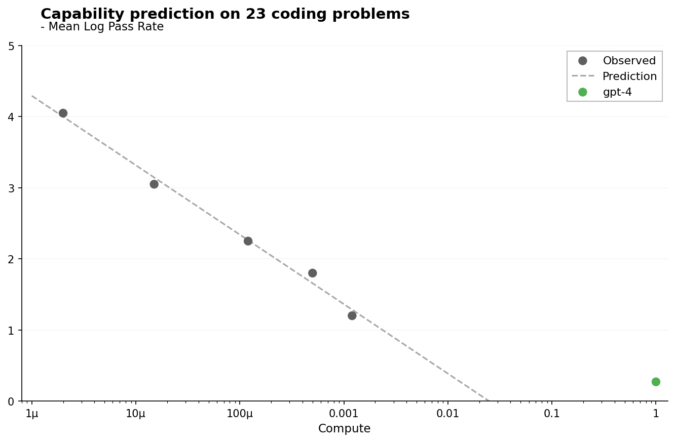
Capability prediction on 23 coding problems
This plot shows the mean log pass rate vs compute for 23 coding problems. It includes observed data points (scatter), a prediction curve (dashed line), and a single highlighted model point (gpt-4) in green. The x-axis is logarithmic and represents compute scale, while the y-axis measures mean log pass rate.
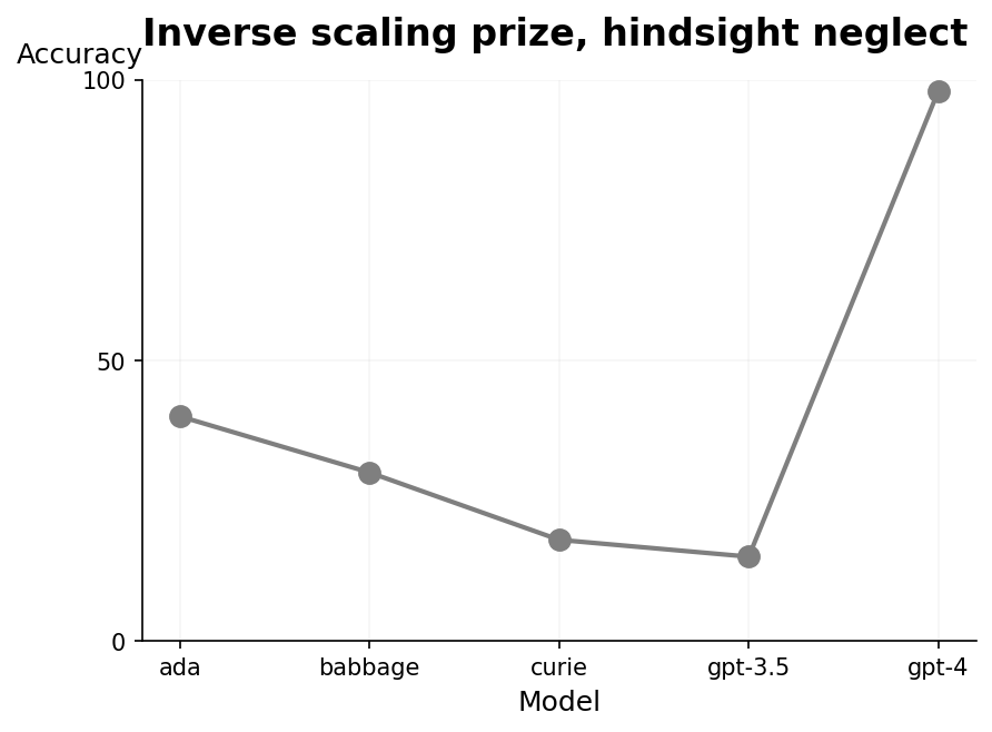
Inverse scaling prize, hindsight neglect
A line plot showing accuracy metric across five different models (ada, babbage, curie, gpt-3.5, gpt-4). The accuracy values are connected by a gray line, with points marked at each model. The plot illustrates a trend where accuracy decreases from ada to gpt-3.5 and then sharply increases for gpt-4.
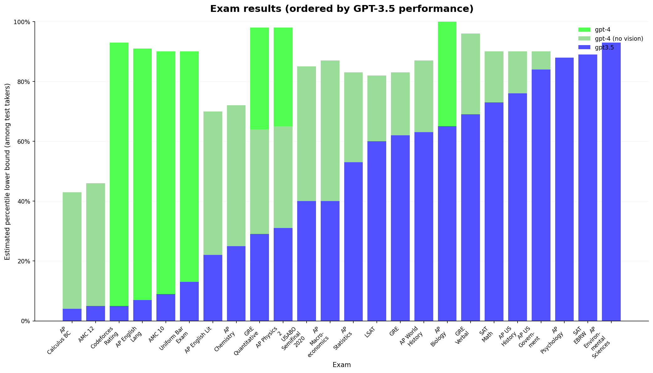
Exam results (ordered by GPT-3.5 performance)
A grouped bar chart showing estimated percentile lower bound performance across multiple exams for three models: GPT-3.5, GPT-4 (no vision), and GPT-4. Each exam is displayed on the x-axis, ordered by GPT-3.5 performance percentile, while the y-axis shows percentile scores up to 100%. Stacked bars are used for the GPT-4 model variants, and GPT-3.5 results are shown in solid color bars.
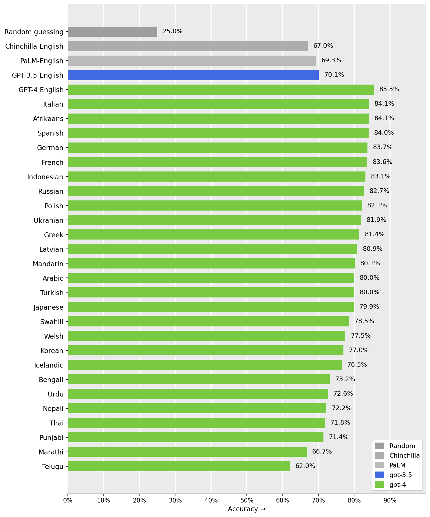
Model Accuracy Comparison Across Languages
Horizontal bar chart showing the accuracy percentages of different models and language pairs. Groups of bars represent model performance: Random guessing, Chinchilla-English, PaLM-English, GPT-3.5-English, and GPT-4 across multiple languages. Bars are colored differently based on model, with GPT-4 results colored in green, GPT-3.5 in blue, PaLM and Chinchilla in shades of grey. The x-axis shows accuracy percentage, and the y-axis lists the languages or baseline names.
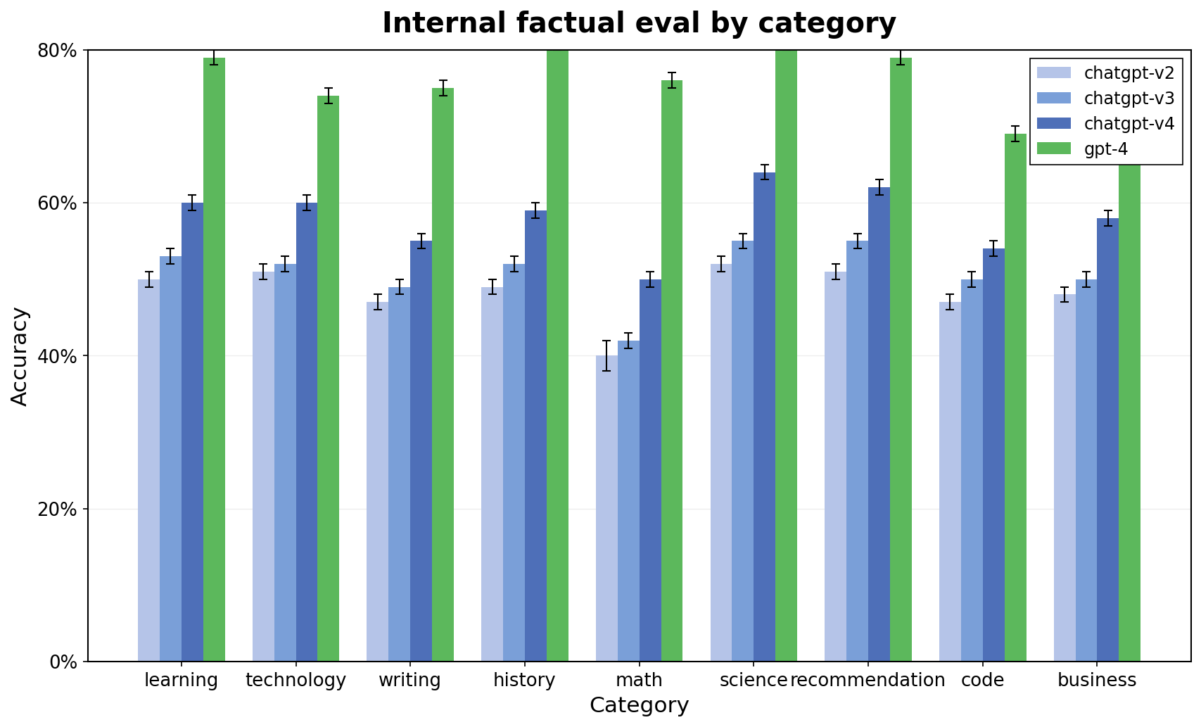
Internal factual eval by category
The plot displays accuracy evaluation across multiple categories comparing four models (chatgpt-v2, chatgpt-v3, chatgpt-v4, gpt-4). Each category has four grouped bars representing model performance, with error bars indicating variability or uncertainty.
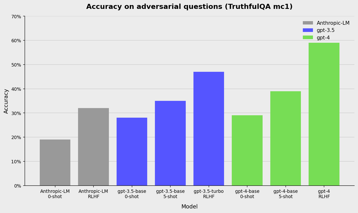
Accuracy on adversarial questions (TruthfulQA nlct)
A bar chart showing the accuracy of three language models (Anthropic-LM, gpt-3.5, gpt-4) on adversarial questions from the TruthfulQA dataset. Bars represent performance under different evaluation setups (0-shot, 5-shot, RLHF, turbo). Accuracy values are visualized as bar heights and percentages on the vertical axis.
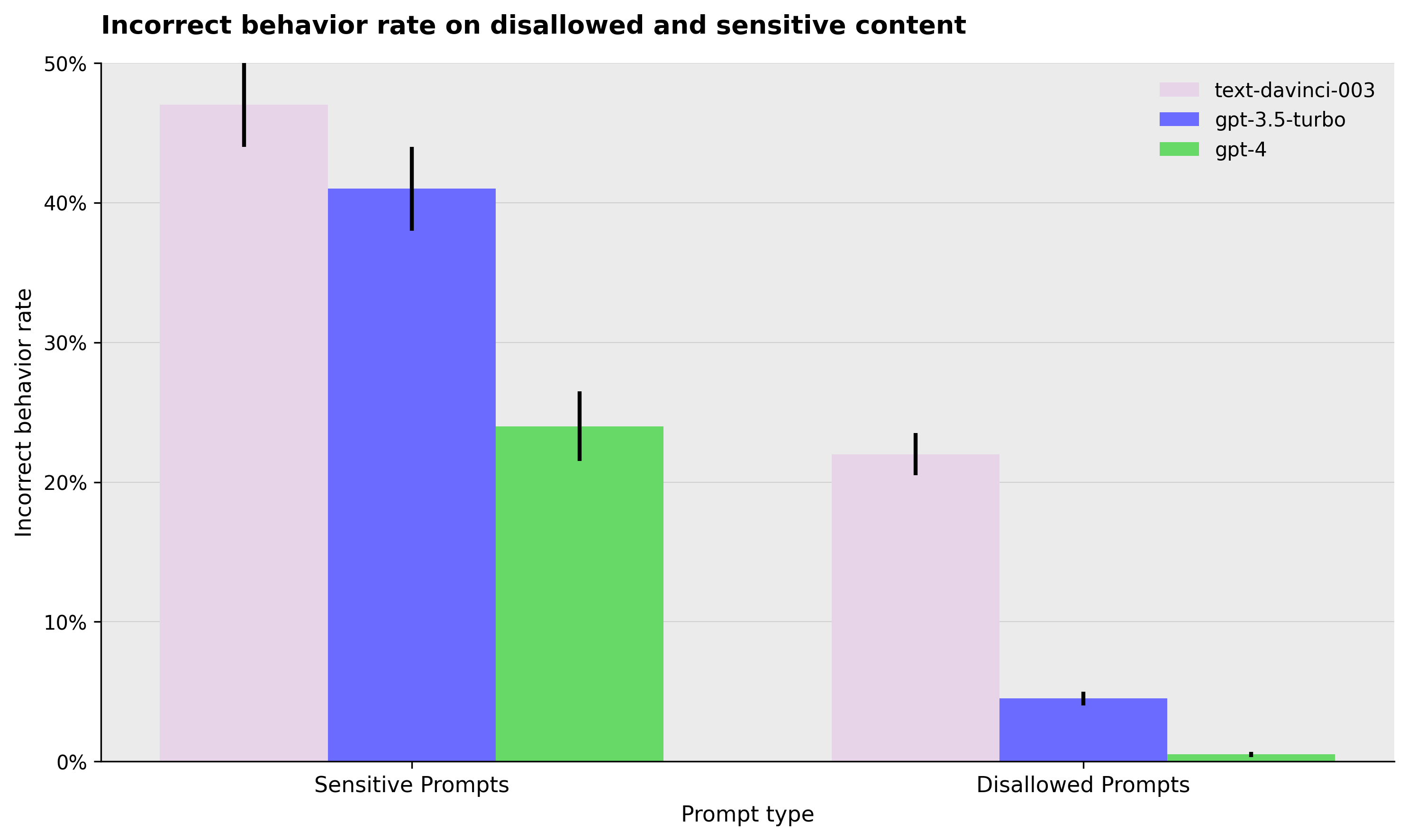
Incorrect behavior rate on disallowed and sensitive content
Bar chart comparing the incorrect behavior rates for different prompt types (Sensitive Prompts and Disallowed Prompts) across three models (text-davinci-003, gpt-3.5-turbo, gpt-4). Error bars are included to indicate variability or uncertainty.
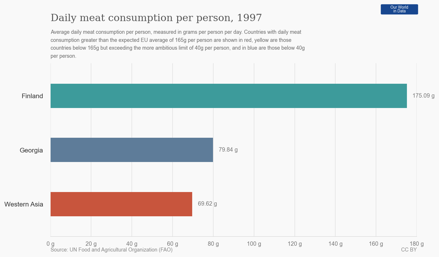
Daily meat consumption per person, 1997
This horizontal bar chart shows the average daily meat consumption per person in grams for three regions in 1997, with values labeled next to each bar and a contextual explanation provided in the title and caption.
Incorrect Behavior Rate on Disallowed and Sensitive Content
This grouped bar chart compares the incorrect behavior rates for three models (text-davinci-003, gpt-3.5-turbo, gpt-4) on two prompt types: Sensitive Prompts and Disallowed Prompts. The y-axis shows the rate as a percentage, with error bars indicating variability or confidence intervals. The chart reveals the relative performance of the models on these prompt categories.
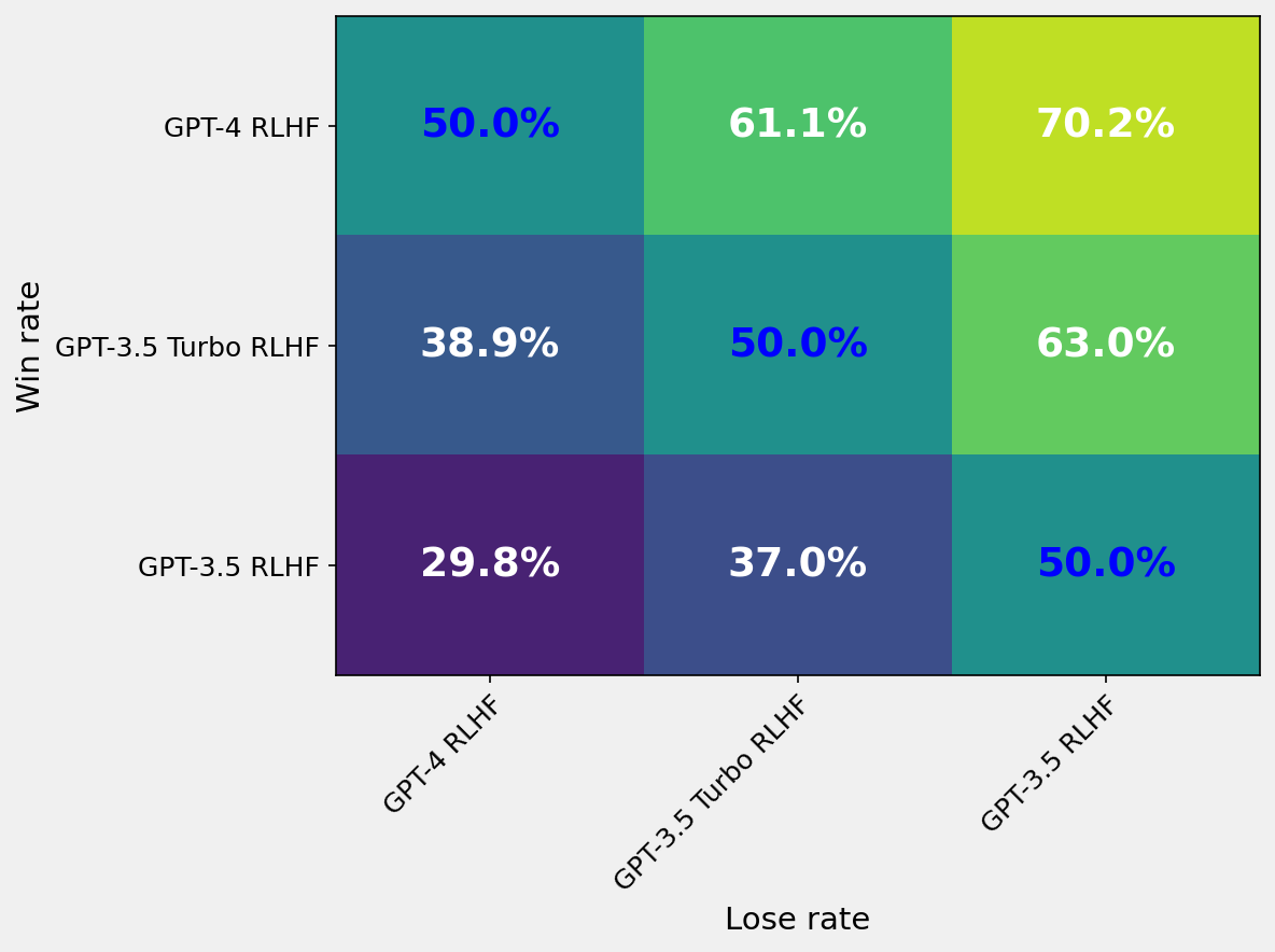
Win Rate Heatmap Comparing Different Models
A heatmap matrix showing pairwise win rates between different model variants (GPT-4 RLHF, GPT-3.5 Turbo RLHF, GPT-3.5 RLHF). The cells are colored with a gradient representing win rate percentages, and the numerical percentage values are annotated inside each cell. The x-axis corresponds to lose rate models, and the y-axis corresponds to win rate models.
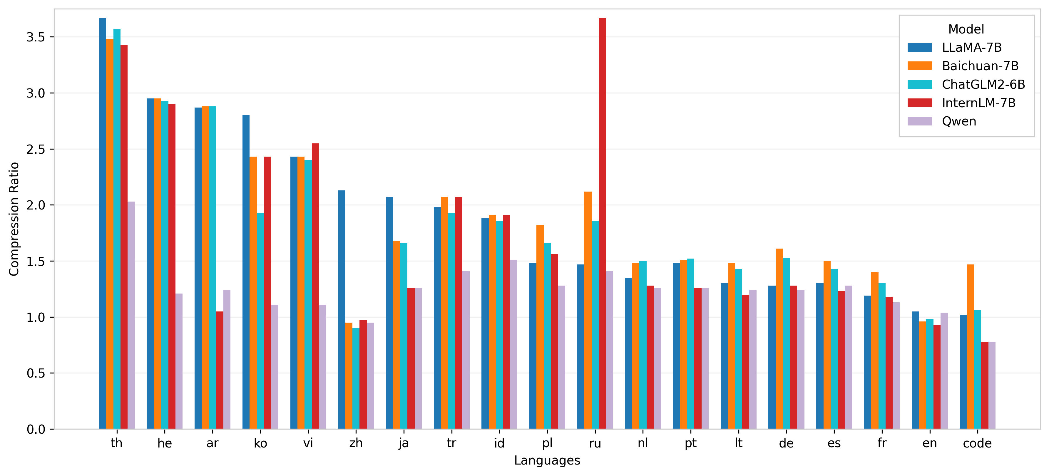
Compression Ratio of Different Models Across Languages
The bar chart compares the compression ratios achieved by five different models (LLAMA-7B, Baichuan-7B, ChatGLM2-6B, InternLM-7B, and Qwen) across multiple languages. The x-axis lists languages using their ISO 639-1 codes, and the y-axis denotes the compression ratio. The grouped bars allow for a direct comparison of model performance per language.
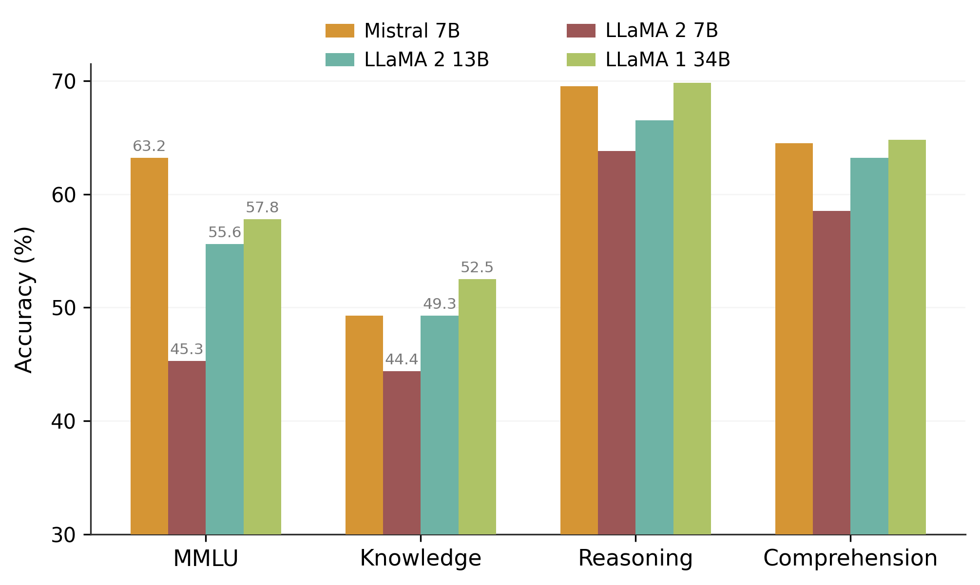
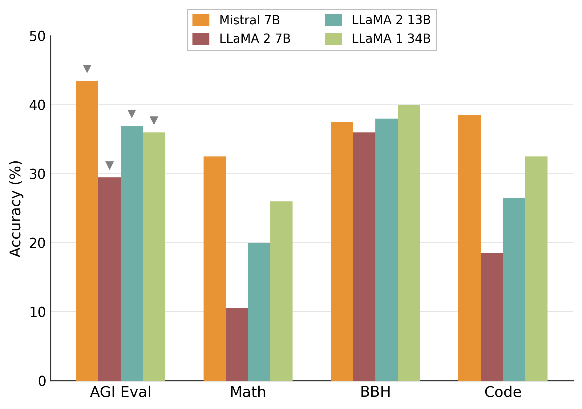
Accuracy Comparison Across Tasks
A grouped bar chart showing accuracy percentages of four different models (Mistral 7B, LLaMA 2 7B, LLaMA 2 13B, LLaMA 1 34B) on four categories of tasks: MMLU, Knowledge, Reasoning, and Comprehension. Each group corresponds to one task, with bars depicting each model's accuracy. Some small icon illustrations overlay the MMLU bar group.
Model Accuracy Comparison Across Evaluation Tasks
This figure shows a grouped bar chart comparing accuracy percentages of four different models (Mistral 7B, LLaMA 2 7B, LLaMA 2 13B, LLaMA 1 34B) across four evaluation benchmarks: AGI Eval, Math, BBH, and Code. Each group on the x-axis represents a task, and bars represent model performance on that task.
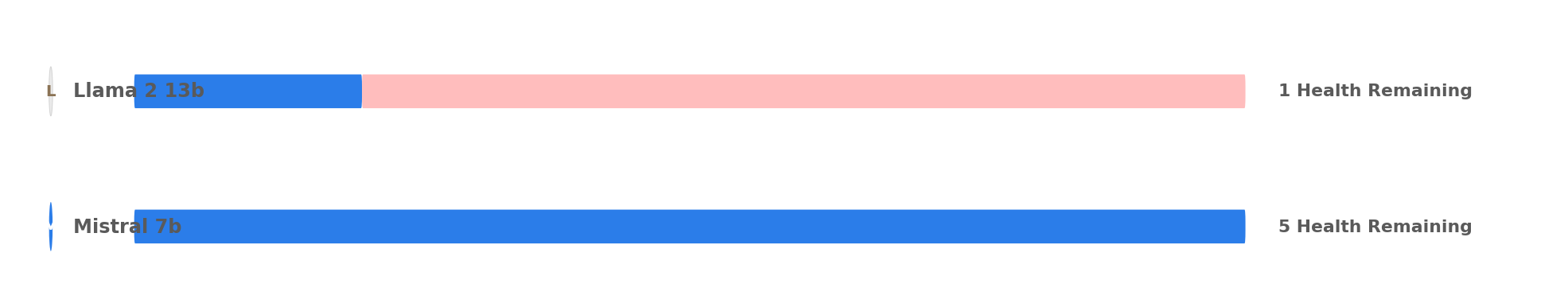
A horizontal grouped bar chart comparing the health remaining metric for two models: Llama 2 13b and Mistral 7b, where the health bars represent their performance with Mistral 7b showing significantly higher health remaining.
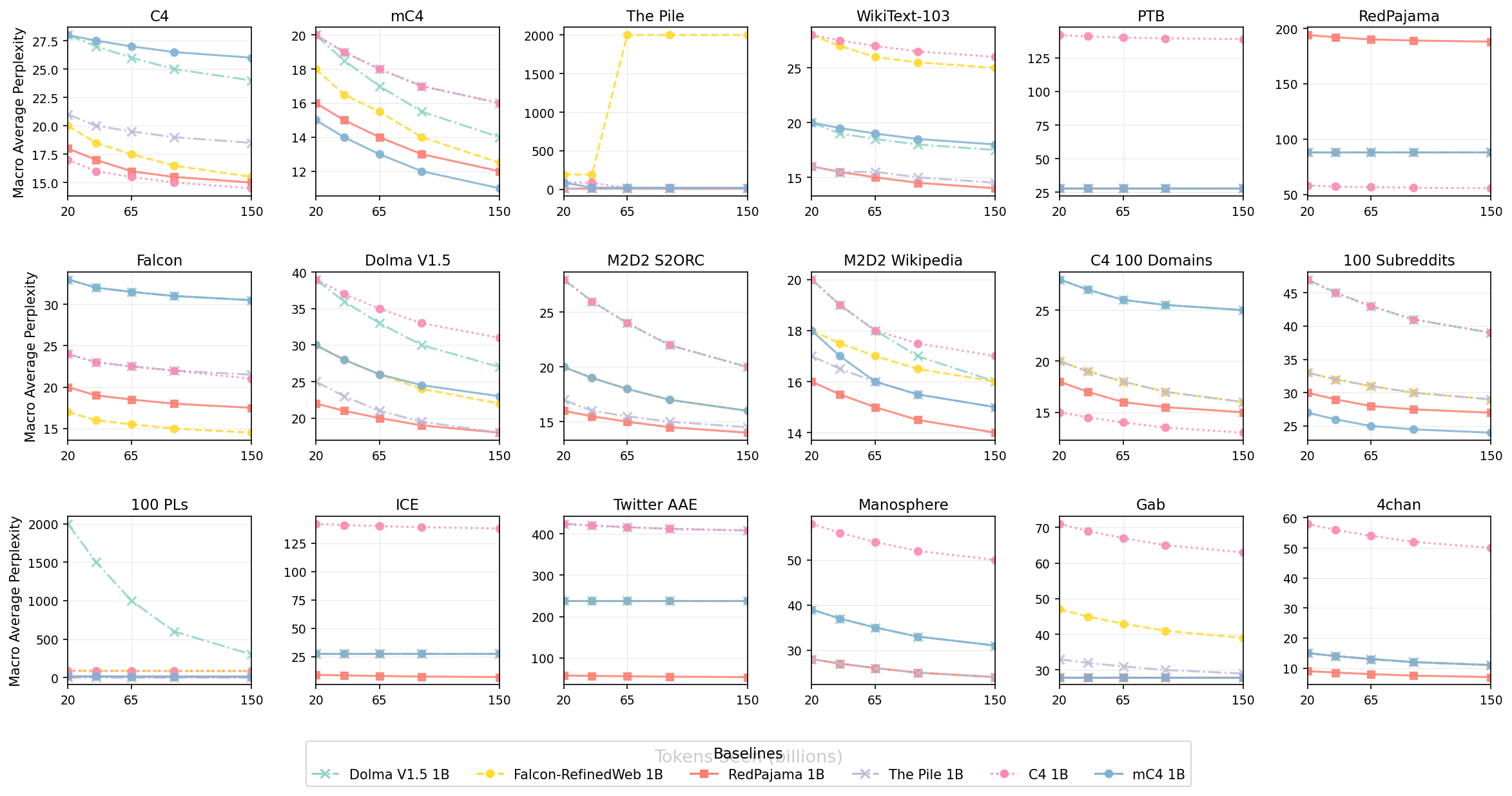
Macro Average Perplexity vs Tokens Seen (billions) across Multiple Datasets
This figure shows macro average perplexity (y-axis) versus tokens seen (in billions on the x-axis) for several datasets or domains (each with its own subplot). Each subplot contains several lines representing different baseline models, allowing comparison of their performance across different scales of training data on different datasets.
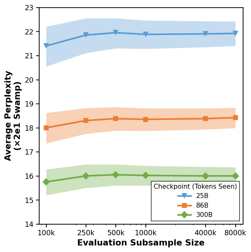
Average Perplexity vs Evaluation Subsample Size
This plot shows the relationship between the evaluation subsample size (x-axis, logarithmic scale implied) and the average perplexity over 20 subsamples (y-axis). Three different checkpoints/models labeled 25B, 86B, and 300B are compared using line plots with shaded regions indicating uncertainty or variance.
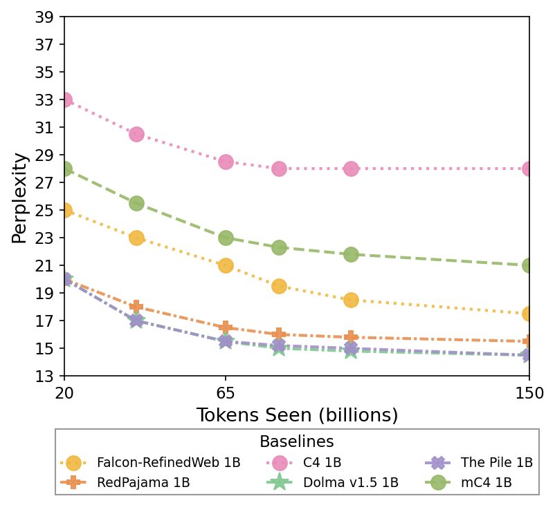
Baselines
The plot shows multiple model baselines' perplexity performance as a function of tokens seen (billions). Each line with unique marker and color represents a different model evaluated over training scale.
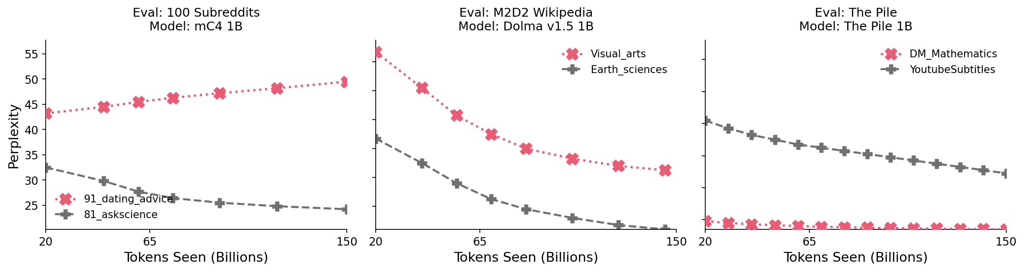
Evaluation on Different Datasets and Models
Three side-by-side line plots comparing model perplexity performance across tokens seen (billions) for different datasets and models. Each plot shows perplexity lines for two datasets within a particular evaluation setting and model.
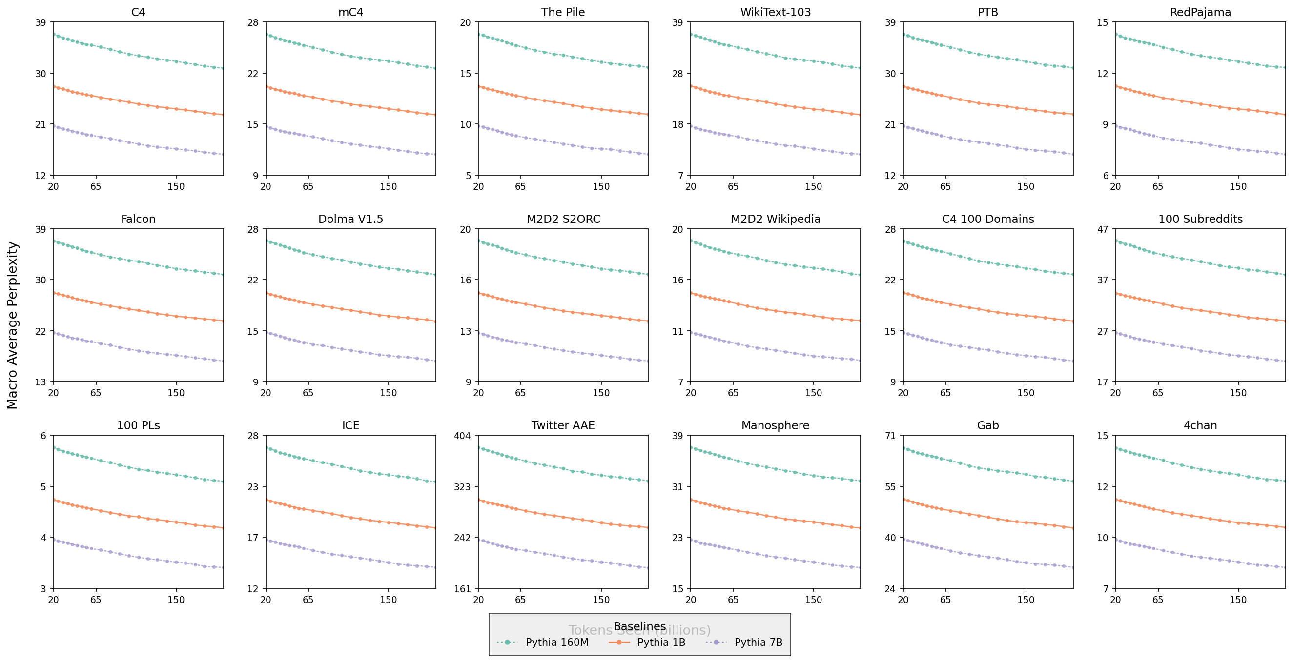
Macro Average Perplexity Across Different Datasets
This visualization presents a 4x5 grid of line plots, each showing the macro average perplexity (y-axis) as a function of tokens seen in billions (x-axis) for three Pythia model sizes (160M, 1B, 7B) across various benchmark datasets like C4, mC4, The Pile, WikiText-103, PTB, RedPajama, and others. Each subplot has lines with distinct markers representing different model sizes, allowing comparison of model performance and scaling behavior across diverse datasets.
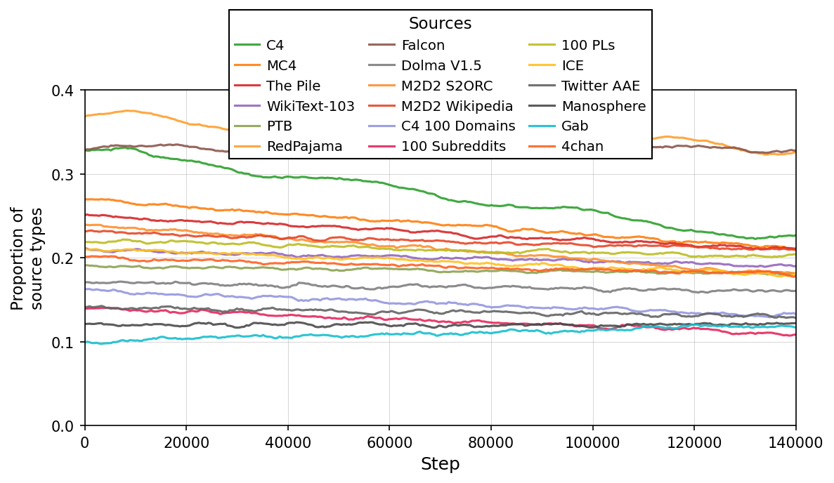
Sources
The plot shows the proportion of different source types over training steps. Each line corresponds to a different source dataset or corpus, tracking how their proportions change as training progresses from step 0 to about 140,000.
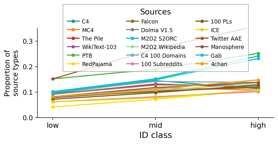
Sources
Line plot showing the proportion of source types across three ID class categories (low, mid, high). Each line corresponds to a different data source, with the legend mapping colors to sources.
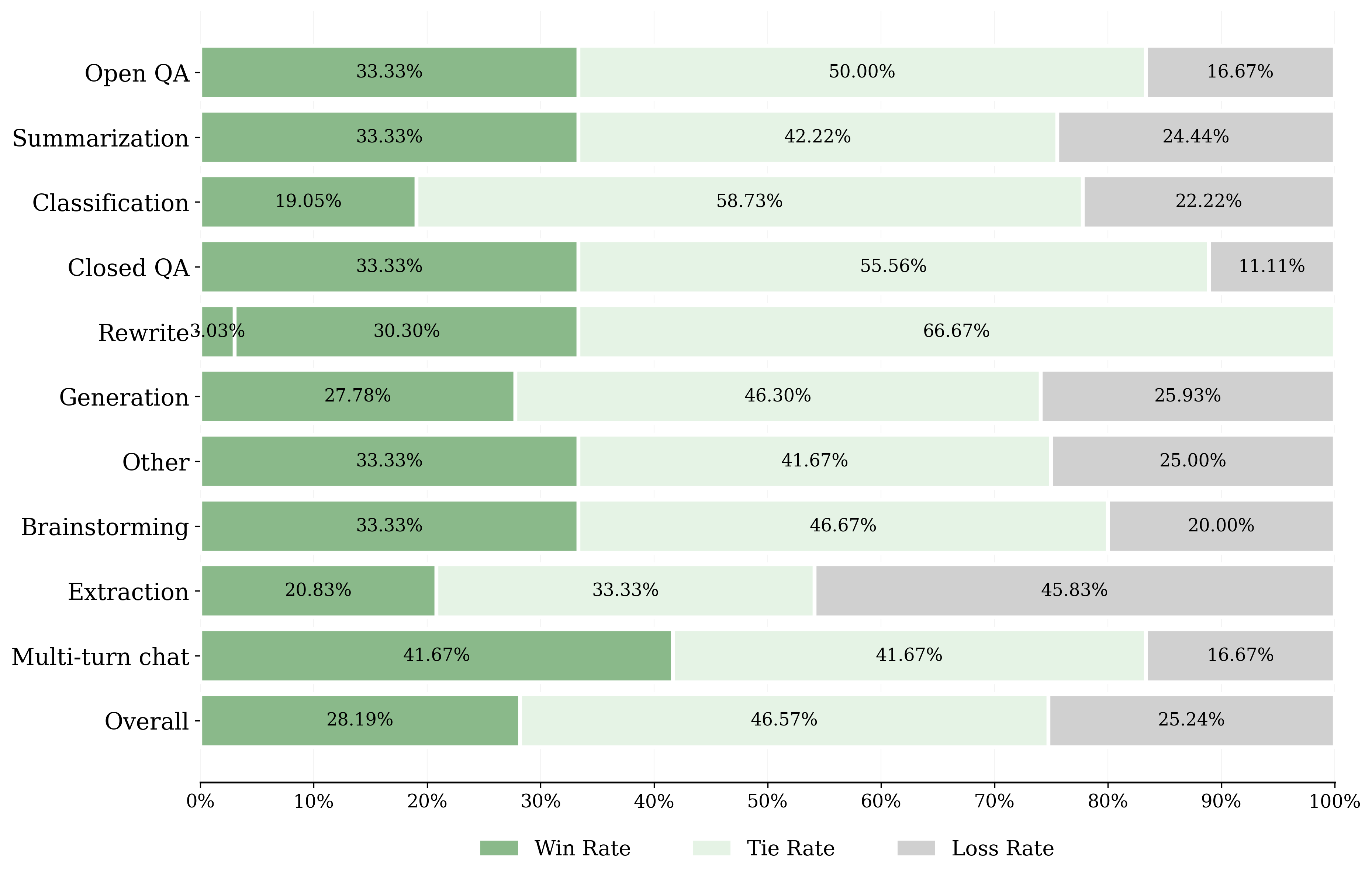
Win, Tie, and Loss Rates by Task
Horizontal grouped bar chart comparing win rate, tie rate, and loss rate across multiple task categories such as Overall, Multi-turn chat, Extraction, Brainstorming, Other, Generation, Rewrite, Closed QA, Classification, Summarization, and Open QA. Each task category is represented by three horizontal bars color-coded with green shades indicating performance outcomes (win, tie, loss) and annotated with percentage values.
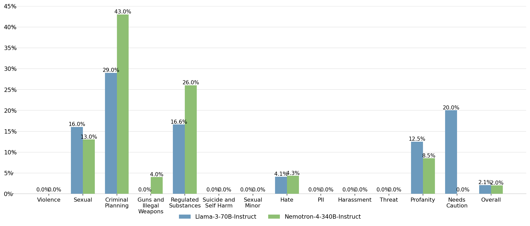
Comparison of Percentage Metrics Across Categories for Two Models
This grouped bar chart displays percentage values for two models, Llama-3-70B-Instruct and Nemotron-4-340B-Instruct, across multiple categories such as Violence, Sexual, Criminal Planning, Guns and Illegal Weapons, etc. Each category has two bars showing the comparative percentage for each model, with numeric percentage labels above the bars.

Validation Loss vs Training Tokens for Different Compute Levels
The plot shows validation loss decreasing as the number of training tokens increases, across multiple compute budgets indicated by different shades of blue. Lines represent smoothed performance trends for each compute level, with scatter points marking actual data observations.
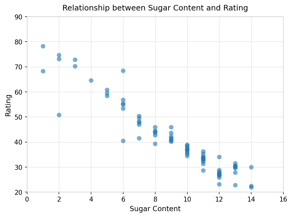
Relationship between Sugar Content and Rating
A scatter plot visualizing the negative relationship between the sugar content of cereals and their overall rating. The plot shows individual data points of cereal samples with sugar content on the x-axis and rating on the y-axis. A simple linear regression model is used to estimate and quantify the relationship with an R^2 value and regression coefficients presented.
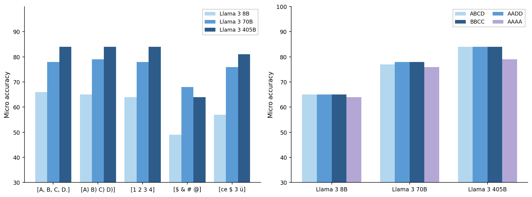
Micro Accuracy Comparison Across Models and Datasets
The figure contains two grouped bar charts side-by-side. The left chart compares micro accuracies for three Llama 3 model sizes (8B, 70B, 405B) across five different input categories. The right chart shows micro accuracies for the same three Llama 3 models across four dataset groupings or labels (ABCD, AADD, BBCC, AAAA). Both charts visualize relative performance of varying model sizes and dataset groups.
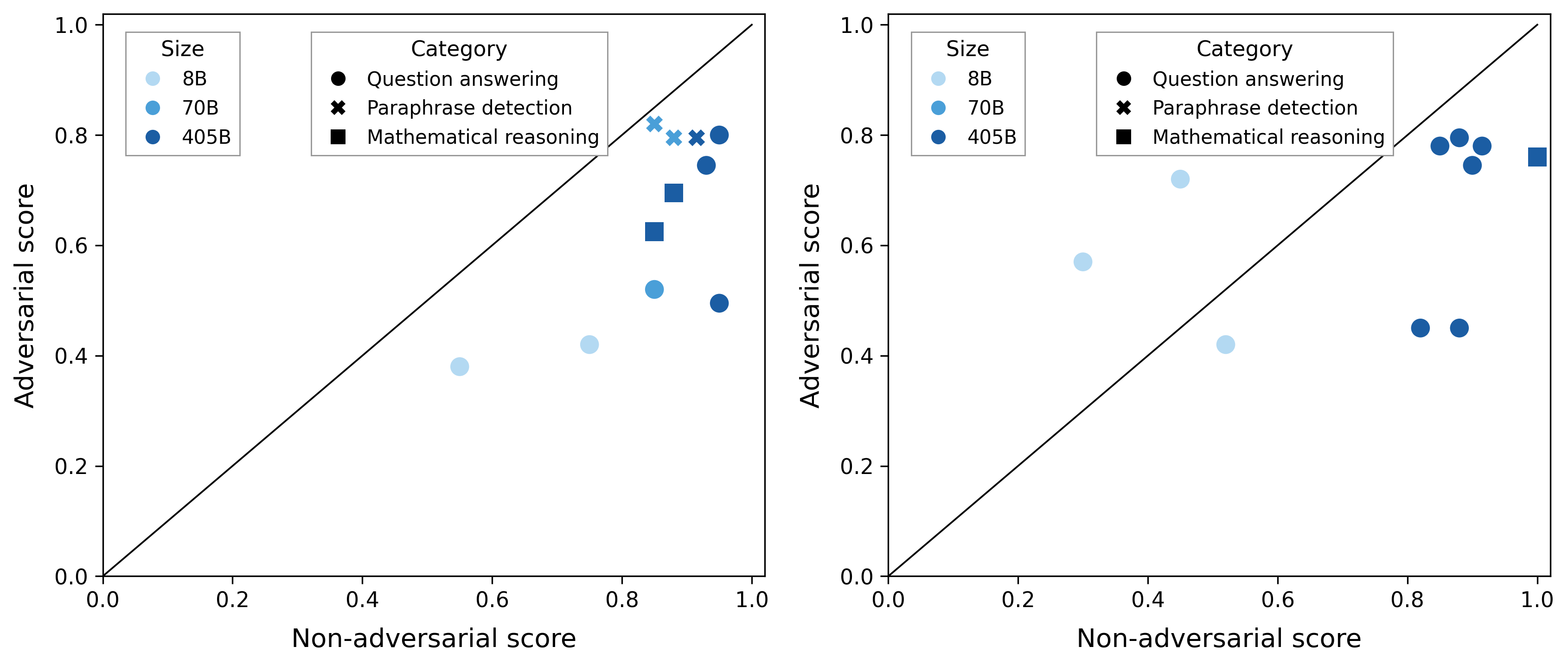
Comparison of Adversarial vs Non-adversarial Scores
Two scatter plots arranged side by side comparing adversarial score (y-axis) against non-adversarial score (x-axis) for various model sizes and task categories. Points are color-coded by model size and shaped by task category. A diagonal line (y=x) is added as a reference. The plots highlight performance trade-offs between adversarial and non-adversarial settings across models and tasks.
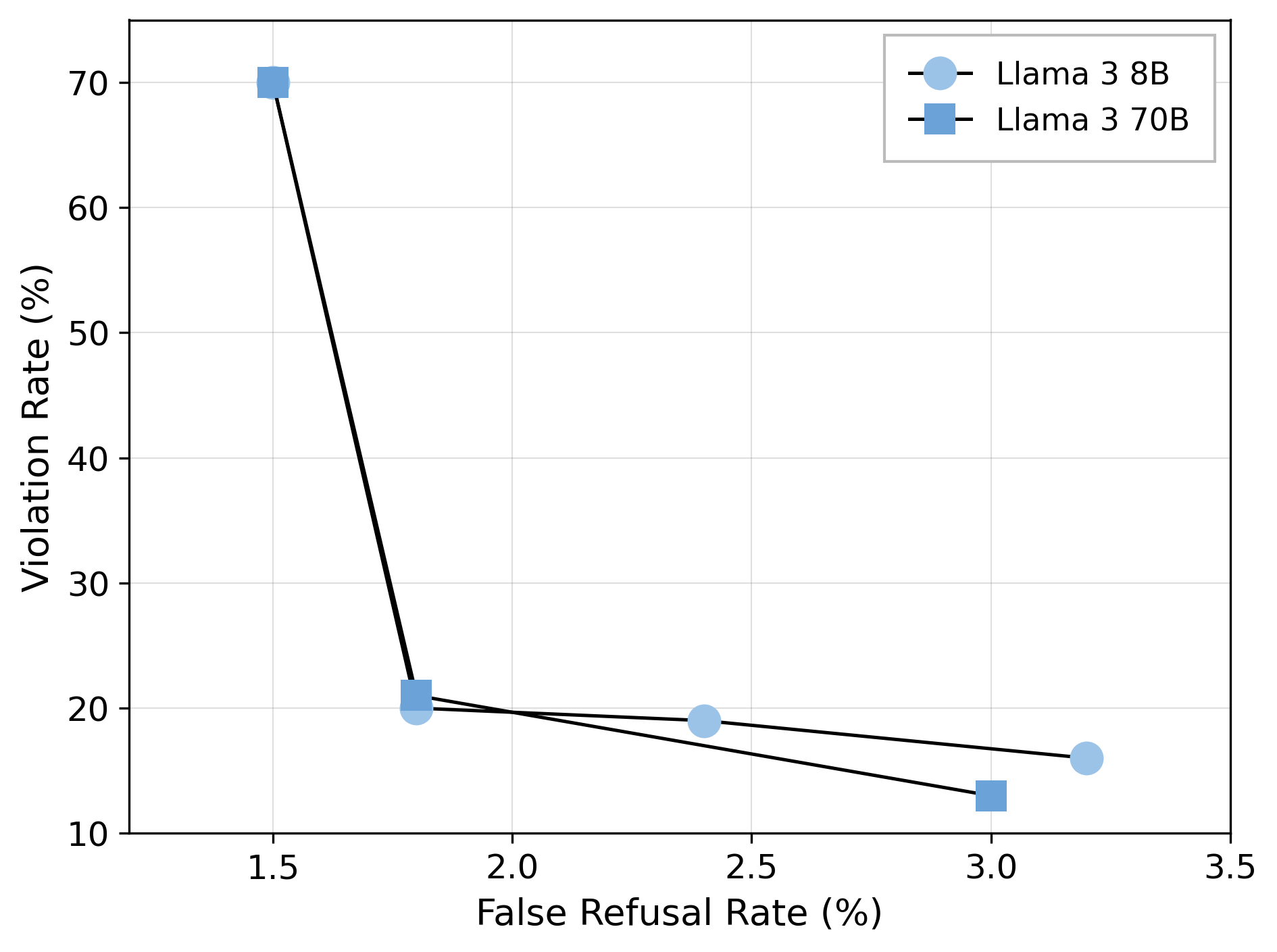
Scatter points connected by lines showing the relationship between False Refusal Rate (%) on the x-axis and Violation Rate (%) on the y-axis for two models: Llama 3 8B and Llama 3 70B. The plot compares how the two models trade off between these two error metrics.
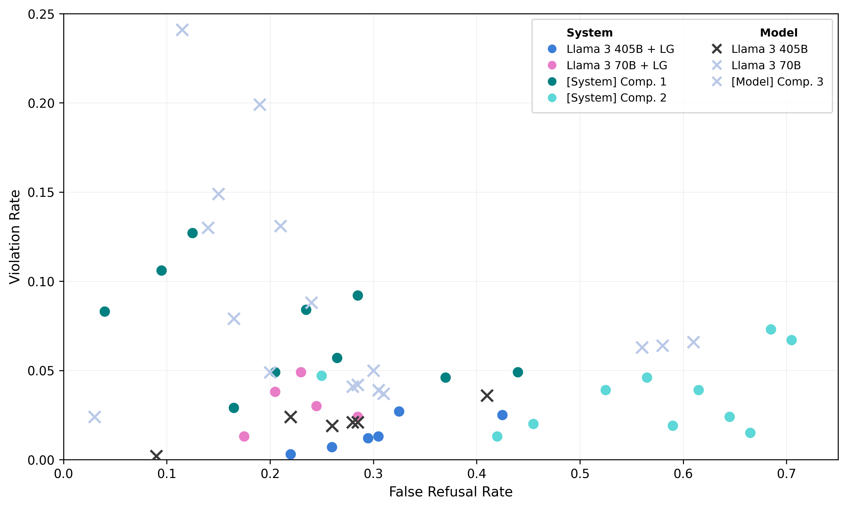
A single scatter plot showing points grouped by different systems and models, plotting Violation Rate against False Refusal Rate. The legend differentiates system and model groups using distinct colors and marker styles.
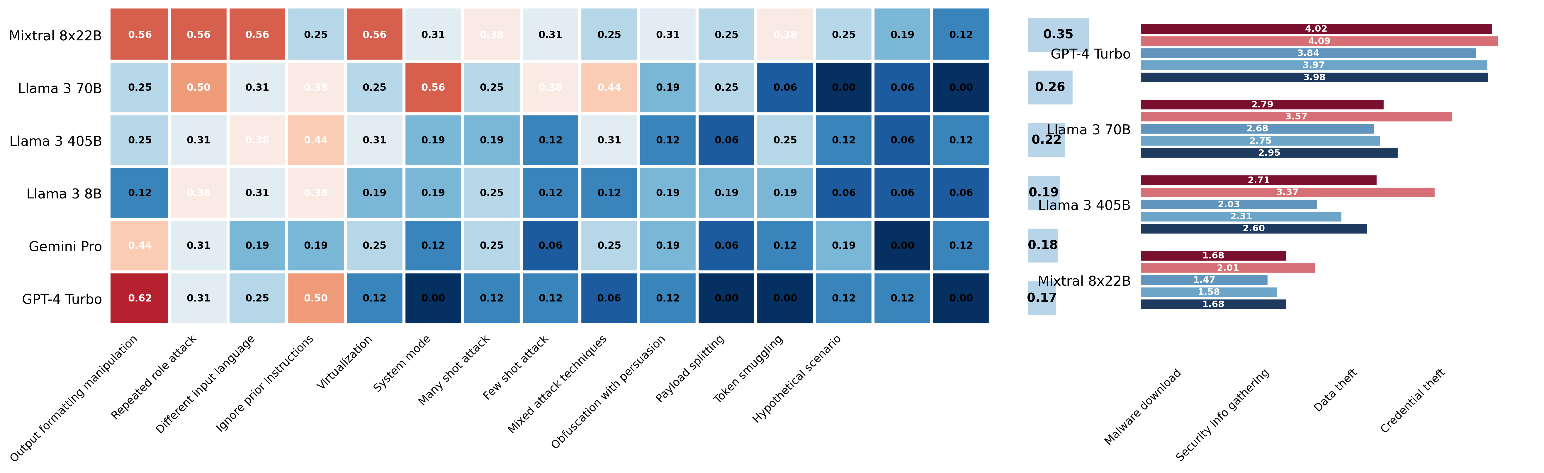
Model Performance Comparison on Various Attack and Security Tasks
The figure shows two heatmap matrices each listing models on the y-axis and tasks or attack types on the x-axis, with color-coded performance scores and numeric annotations inside the heatmap cells. To the right of each heatmap is a horizontal bar chart summarizing or aggregating the performance scores per model. The left panel has a more complex x-axis with multiple attack/hypothetical scenario categories, while the right panel lists security-related attack types. The heatmaps convey detailed per-task scores and the bar charts provide summarized model-level performance, enabling comparison across several models and tasks.
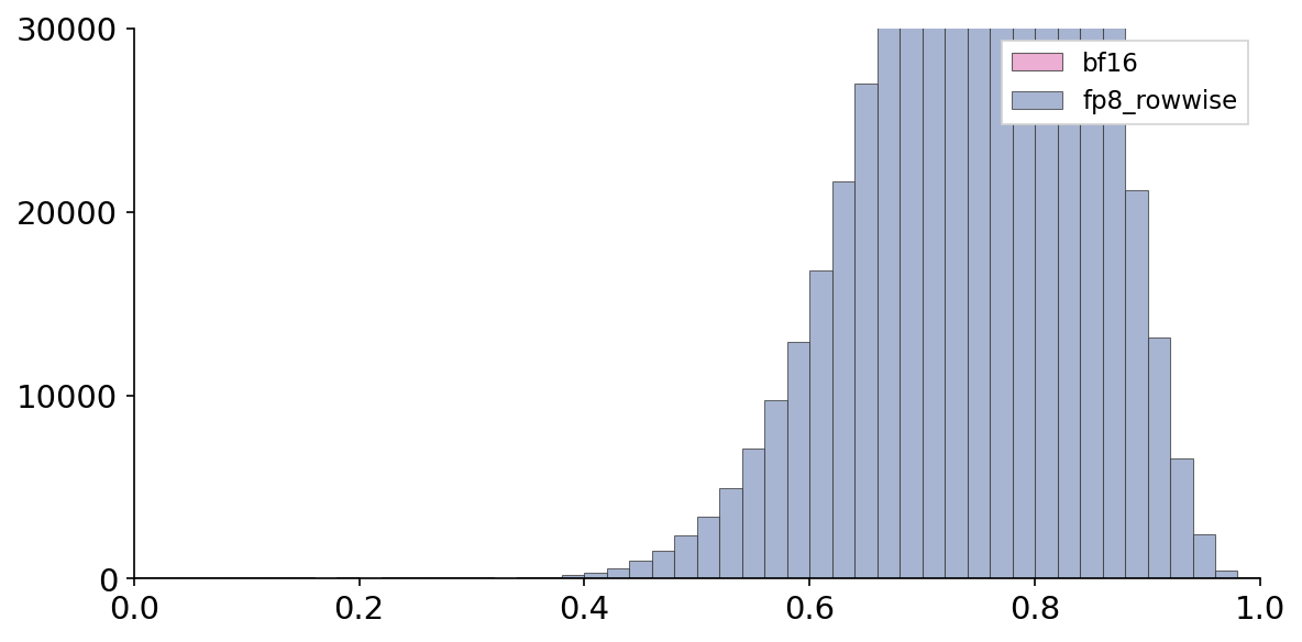
A single grouped bar chart showing the distribution of values from 0 to 1 on the x-axis with counts on the y-axis. Two different groups, labeled 'bf16' and 'fp8_rowwise', are compared side-by-side in bars across bins.
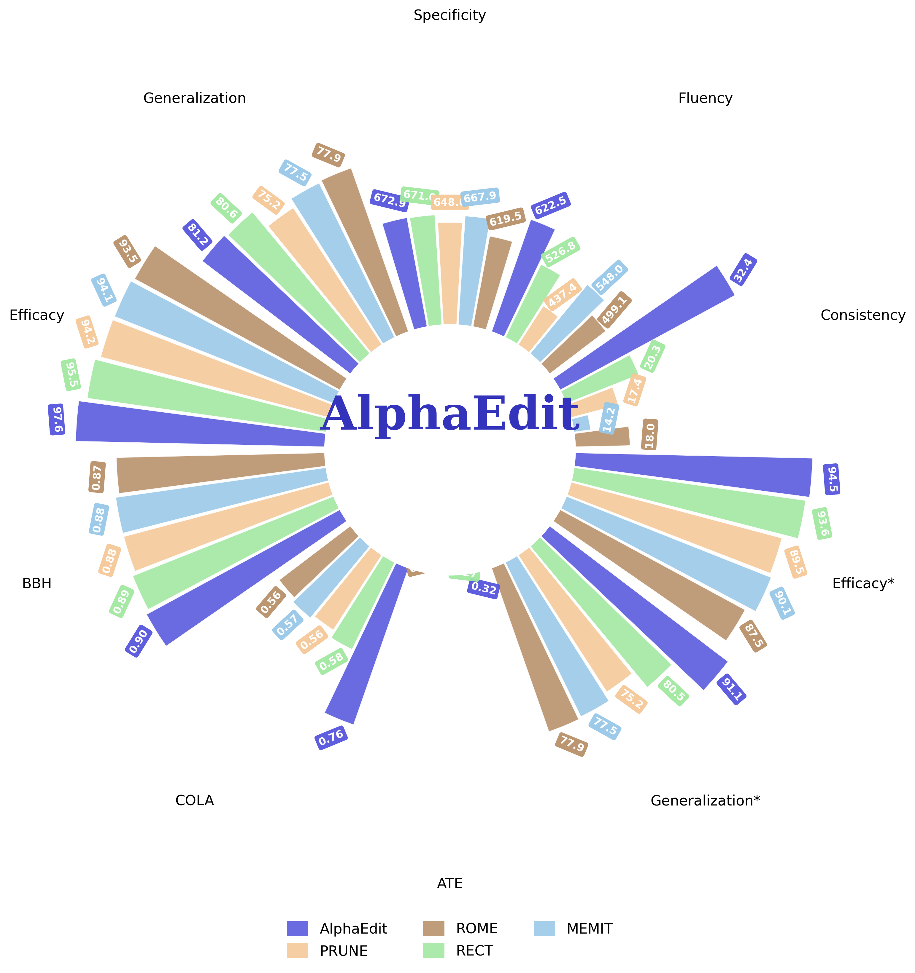
AlphaEdit - One Line of Code, Transformative Performance Improvements!
A radial grouped bar chart comparing performance of different methods (AlphaEdit, PRUNE, ROME, RECT, MEMIT) across multiple metrics/categories such as Specificity, Generalization, Efficacy, SST, CoLA, RTE, Fluency, Consistency, etc. Each category has bars radiating outward corresponding to metrics values for the various methods. The visualization highlights AlphaEdit's superior performance with larger bars and darker color.
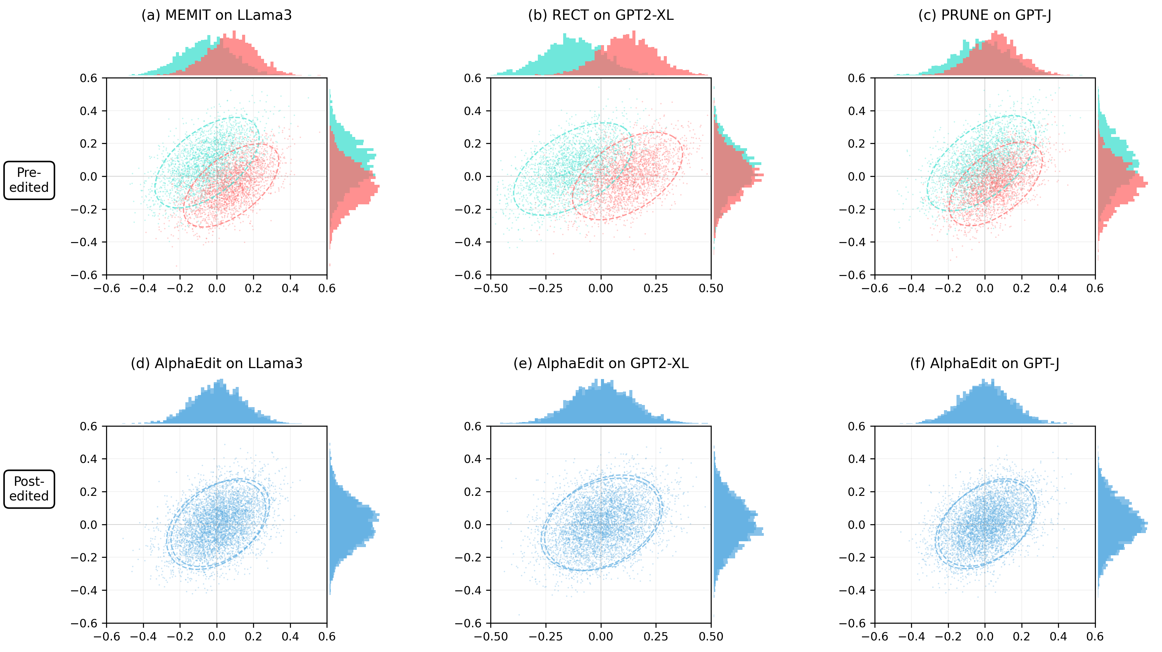
Distribution and Scatter Plot Comparisons of Pre-edited and Post-edited Embeddings
This figure shows a 2x3 grid of plots comparing pre-edited and post-edited embedding distributions across different models and editing methods. Each subplot combines a central scatter plot of two-dimensional embeddings with marginal distribution plots showing the distribution of embeddings along each axis. The colors distinguish pre-edited (blue/cyan) and post-edited (red/pink or blue) embeddings, visualizing shifts in embedding space due to edits across methods MEMIT, RECT, PRUNE, and AlphaEdit on models LLaMA3, GPT2-XL, and GPT-J.
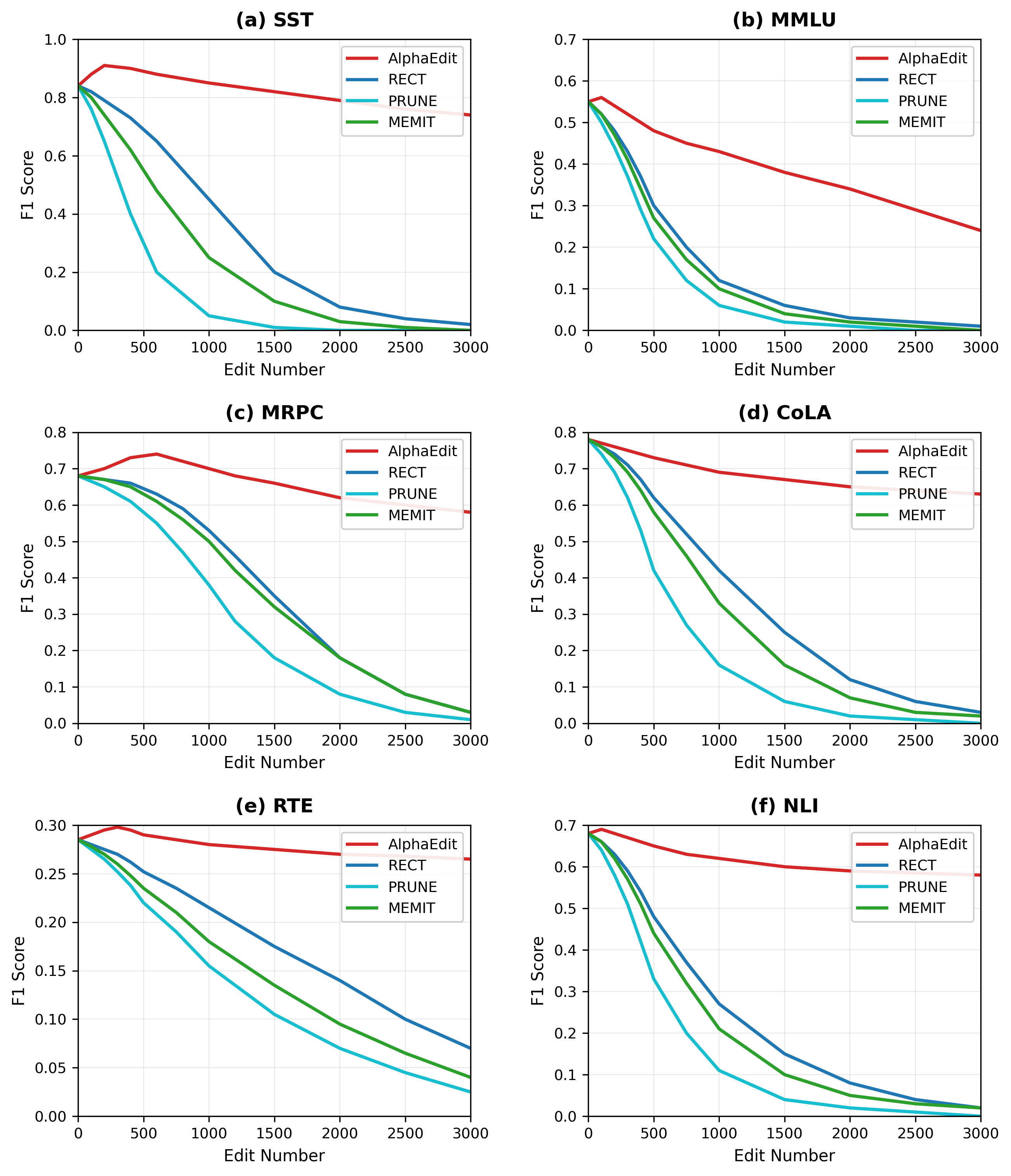
Model performance comparison across datasets
This figure is a 2x3 grid of line plots showing F1 Score versus Edit Number for four methods (AlphaEdit, RECT, PRUNE, MEMIT) on six different datasets/tasks: SST, MMLU, MRPC, CoLA, RTE, and NLI. Each subplot compares the performance degradation or stability of these methods as the number of edits increases, illustrating their robustness or effectiveness over several NLP tasks.
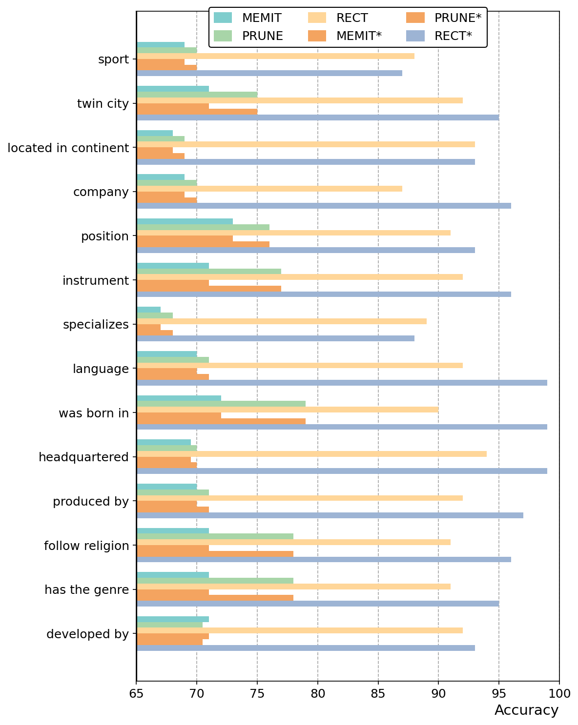
Accuracy
A grouped horizontal bar chart comparing the accuracy performance of six models (MEMIT, MEMIT*, PRUNE, PRUNE*, RECT, RECT*) on 13 different relation types or categories such as sport, twin city, located in continent, company, etc. It shows how different model variants perform across various relations.
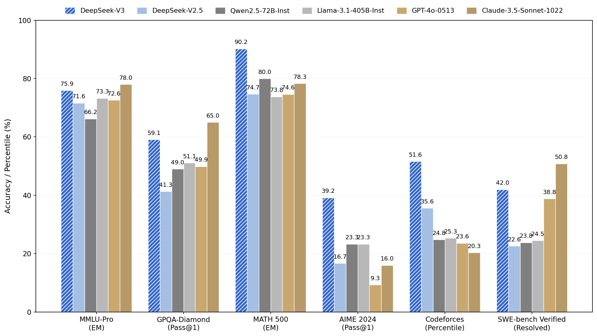
Performance Comparison Across Benchmarks
A grouped bar chart showing performance metrics (accuracy or percentile) measured for six different benchmarks: MMLU-Pro, GPQA-Diamond, MATH 500, AIME 2024, Codeforces, and SWE-bench Verified. Multiple models (DeepSeek-V3, DeepSeek-V2.5, Qwen2.5-72B-Inst, Llama-3.1-405B-Inst, GPT-4o-0513, Claude-3.5-Sonnet-1022) are compared based on their scores for each benchmark.
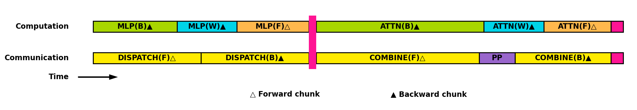
Computation and Communication Timeline
A horizontal timeline visualization illustrating computations (MLP and ATTENTION modules) and communication steps (DISPATCH and COMBINE operations) over time, with blocks colored differently to denote activity types. Forward and backward chunks are marked with distinct symbols. The vertical alignment distinguishes computation from communication phases.
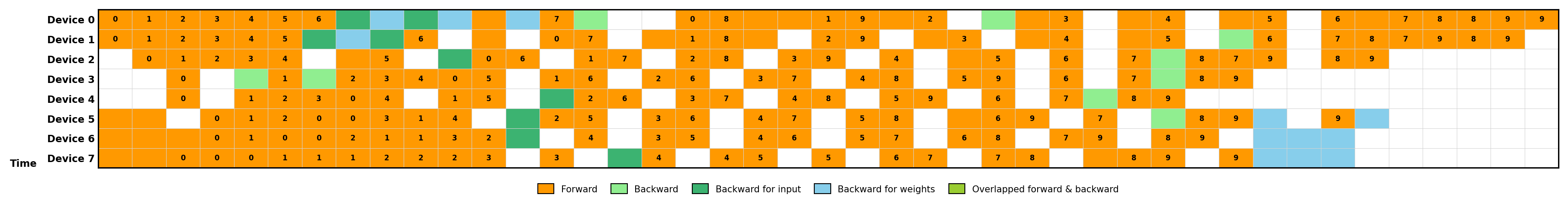
Task Execution Timeline Across Devices
This figure shows a timeline of operations performed on multiple devices (Device 0 to Device 7) over time. Each cell is colored and labeled to denote different phases of computation: forward pass, backward pass (split into backward for input and weights), and overlapped forward and backward operations. It highlights parallelism and overlap in computations for efficiency.
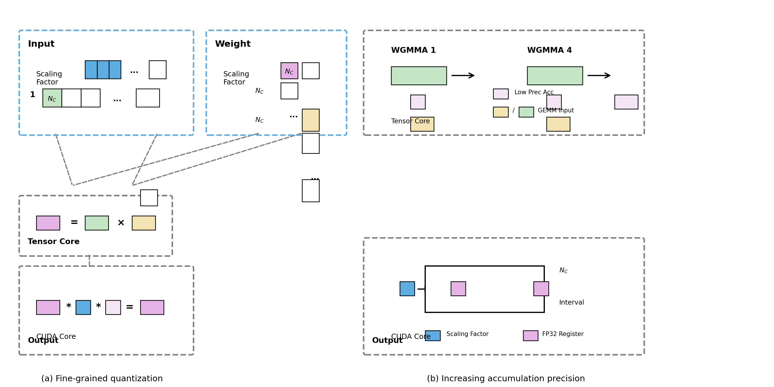
Fine-grained quantization and Increasing accumulation precision
This figure illustrates a fine-grained quantization process and the increasing accumulation precision in tensor core operations, showing input and weight scaling, tensor core computations, CUDA core output formation, and accumulation precision increase across multiple steps. It combines visual blocks, symbolic mathematical relations, and directed arrows to visualize data flow and tensor computations.
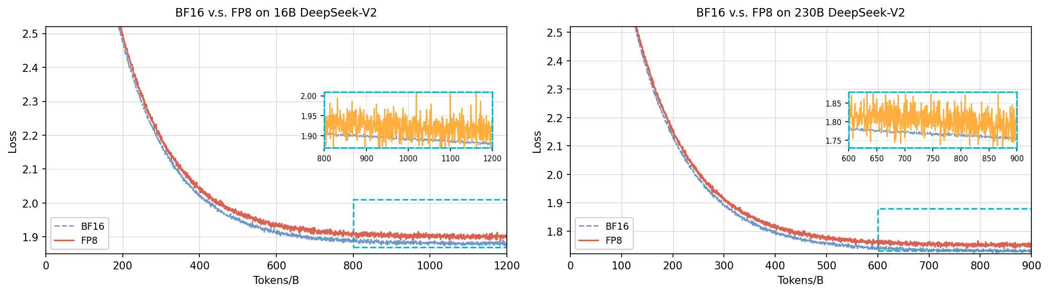
BF16 v.s. FP8 on 16B and 230B DeepSeek-V2
The figure shows two side-by-side line plots comparing loss curves over tokens/batches for BF16 and FP8 numerical precision formats on 16 billion and 230 billion parameter DeepSeek-V2 models respectively. Each plot has an inset zoom visualization focusing on subtle fluctuations in loss difference.
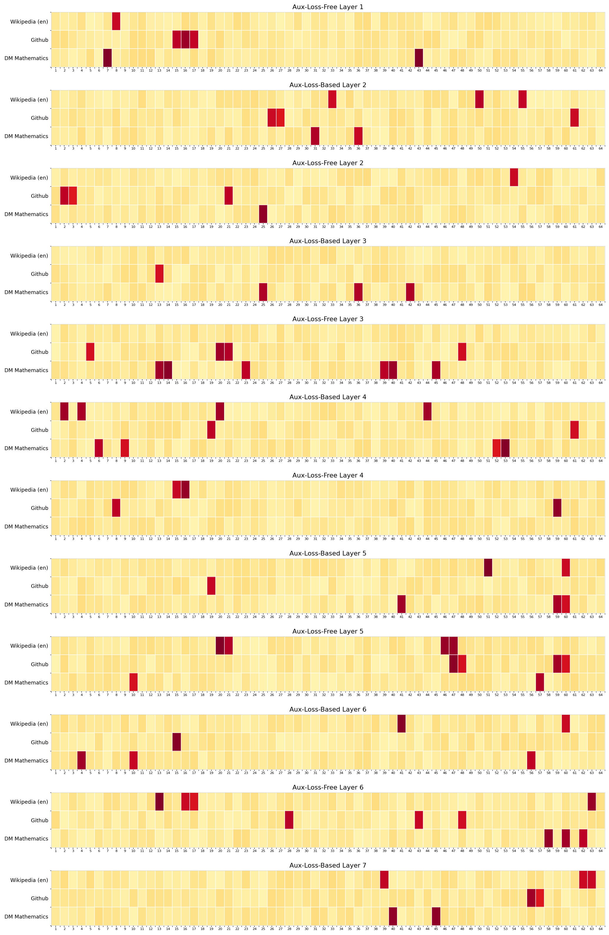
Aux-Loss-Based and Aux-Loss-Free Layer Heatmap Comparisons
This figure shows a vertical stack of 12 heatmap matrices comparing data distributions or activations across three different datasets (Wikipedia (en), Github, DM Mathematics) along the y-axis versus 64 features or units along the x-axis. Each heatmap is labeled by its corresponding layer index with distinctions between Aux-Loss-Based and Aux-Loss-Free models. The color intensity indicates value magnitude/density for each dataset-feature pair.
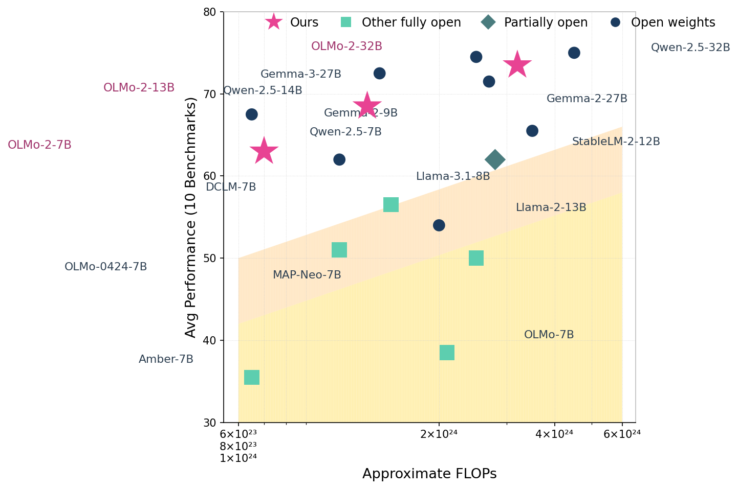
Performance vs. FLOPs for Various Models
The scatter plot shows average performance on 10 benchmarks versus the approximate FLOPs of different model variants from various categories: 'Ours', 'Other fully open', 'Partially open', and 'Open weights'. Each point represents a model, labeled by name and size. A shaded yellow area highlights a performance scaling boundary, with 'Ours' models marked by stars, outperforming other models in terms of performance relative to computational cost.
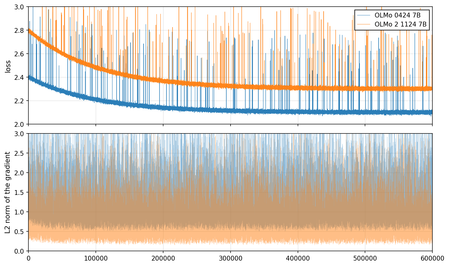
Loss and Gradient Norms for Two Models Over Training Steps
This figure consists of two vertically stacked line plots. The top plot shows the loss values over training steps for two different models, with loss decreasing over time. The bottom plot depicts the L2 norm of the gradient over training steps for the same two models, illustrating gradient behavior and variance during training. Each plot contains two lines representing two models labeled 'OLMo 0424 7B' and 'OLMo 2 1124 7B'.
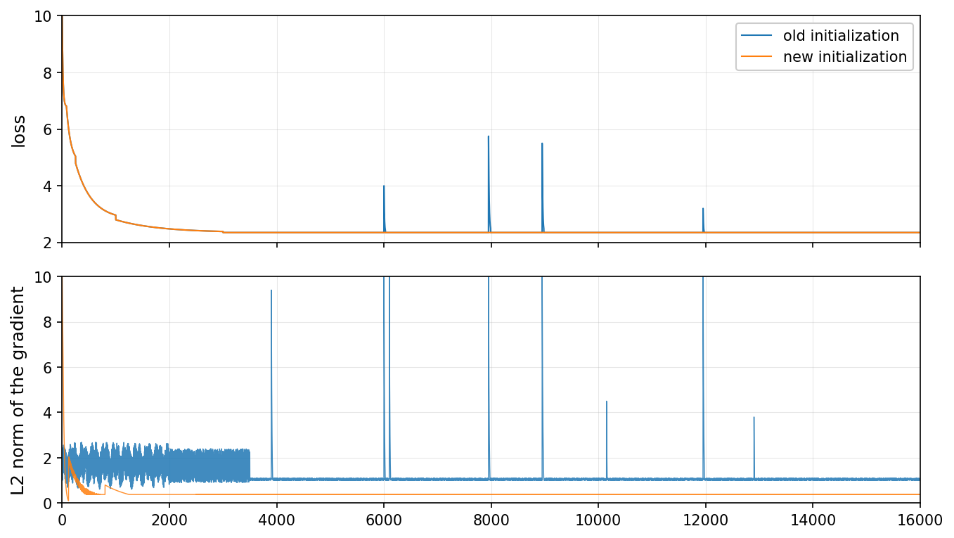
Training loss and gradient norm comparison for old vs new initialization
The figure contains two vertically aligned line plots. The top subplot shows the training loss curve over iterations for two initialization methods: 'old initialization' and 'new initialization'. The bottom subplot shows the L2 norm of the gradient over the same iterations for these methods. Both plots have loss and gradient norm on y-axis and training iterations on x-axis. The comparison highlights differences in training dynamics and gradient behavior during optimization.
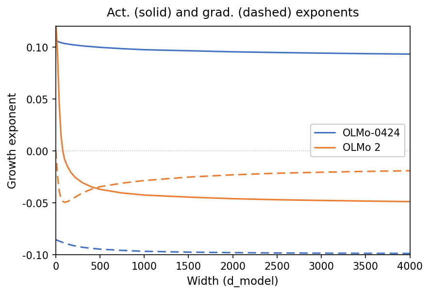
Act. (solid) and grad. (dashed) exponents
This figure shows the growth exponent (y-axis) as a function of model width (x-axis). It compares two models (OLMo-0424 and OLMo 2) with solid lines representing activation exponents and dashed lines representing gradient exponents. The plot reveals how these exponents change with increasing model width.
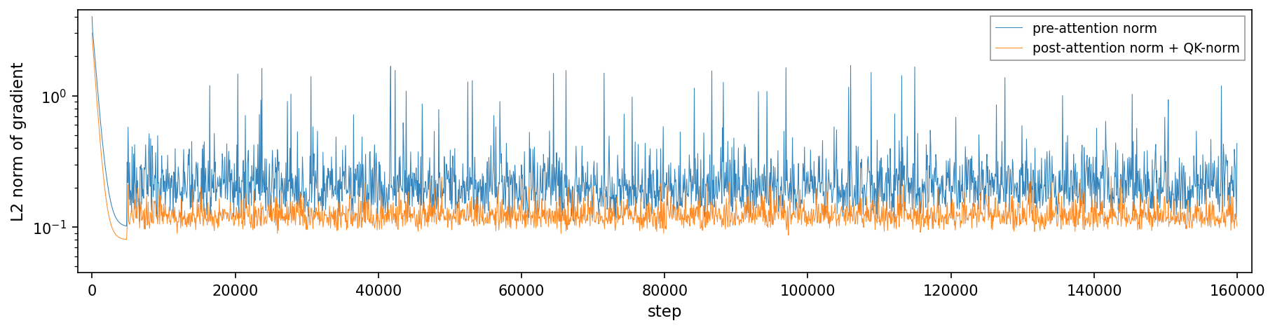
A single plot showing the L2 norm of gradients over training steps, comparing pre-attention normalization and post-attention normalization combined with QK normalization. The x-axis represents training steps, and the y-axis (log scale) shows the L2 norm magnitude, illustrating gradient behavior during training.
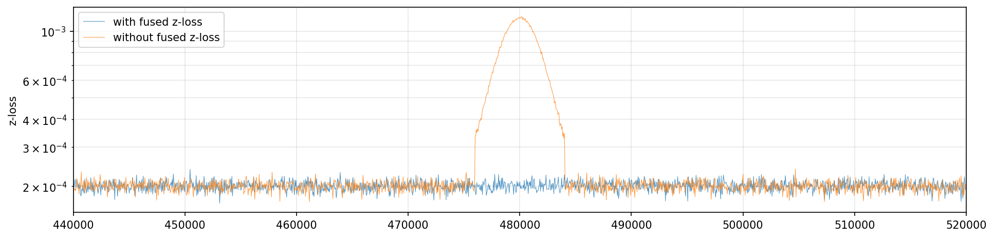
Comparison of z-loss with and without fused z-loss
This figure shows a line plot comparing the z-loss metric over training steps (likely iterations or epochs) for two different conditions: 'with fused z-loss' and 'without fused z-loss'. The x-axis represents training steps ranging approximately from 440,000 to 520,000, and the y-axis is the z-loss shown on a logarithmic scale. The plot illustrates that the z-loss remains very low and stable for the fused version, while without fusion the z-loss sharply increases and saturates near 1.
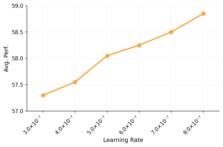
Learning Rate vs Avg. Perf.
The plot shows average performance as a function of learning rate. The x-axis is the learning rate in scientific notation, and the y-axis is average performance metrics. A single line with discrete points connects performance values at various learning rates.
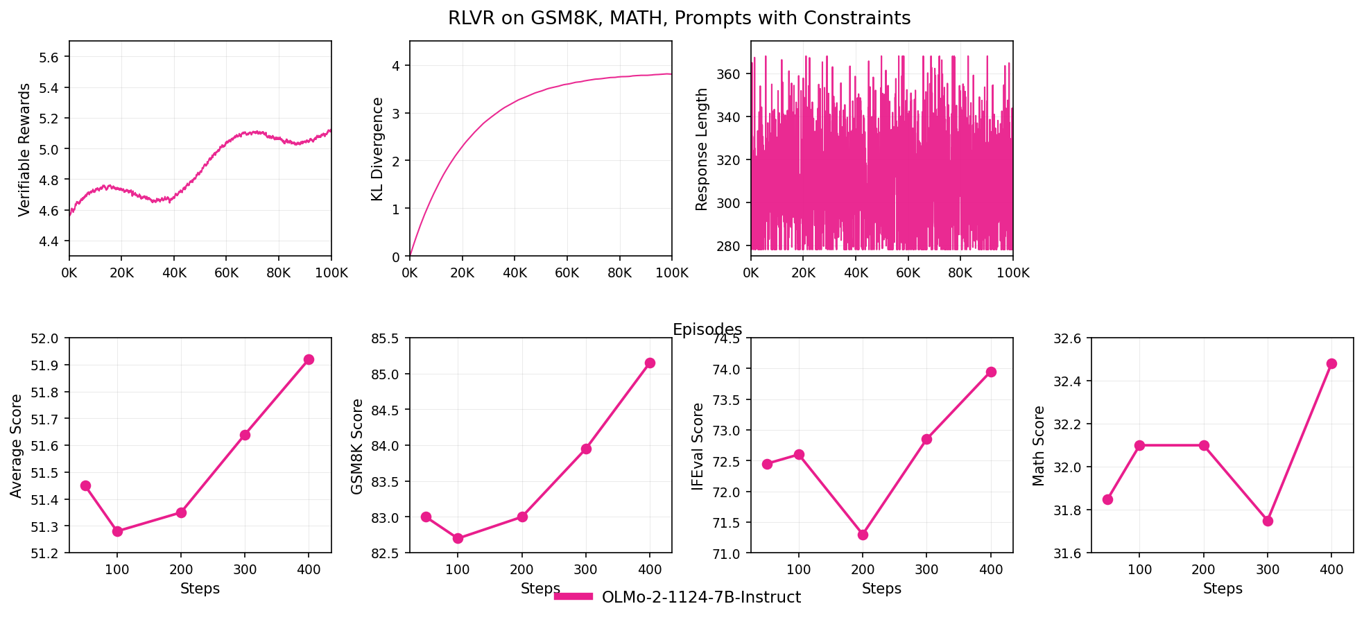
RLVR on GSM8K, MATH, Prompts with Constraints
The figure is composed of seven line plots arranged in a 2x4 grid showing various metrics over training episodes or steps for the RLVR method applied to GSM8K and MATH datasets. The top row depicts curves of Verifiable Rewards, KL Divergence, and Response Length over episodes, while the bottom row shows Average Score, GSM8K Score, IFEval Score, and Math Score over steps, all related to model performance evaluation.
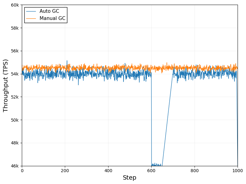
Throughput (TPS) over Steps Comparing Auto GC and Manual GC
This plot shows throughput (in TPS) as a function of training or execution step for two garbage collection methods: Auto GC and Manual GC. The two line traces compare the performance dynamics of these two methods.
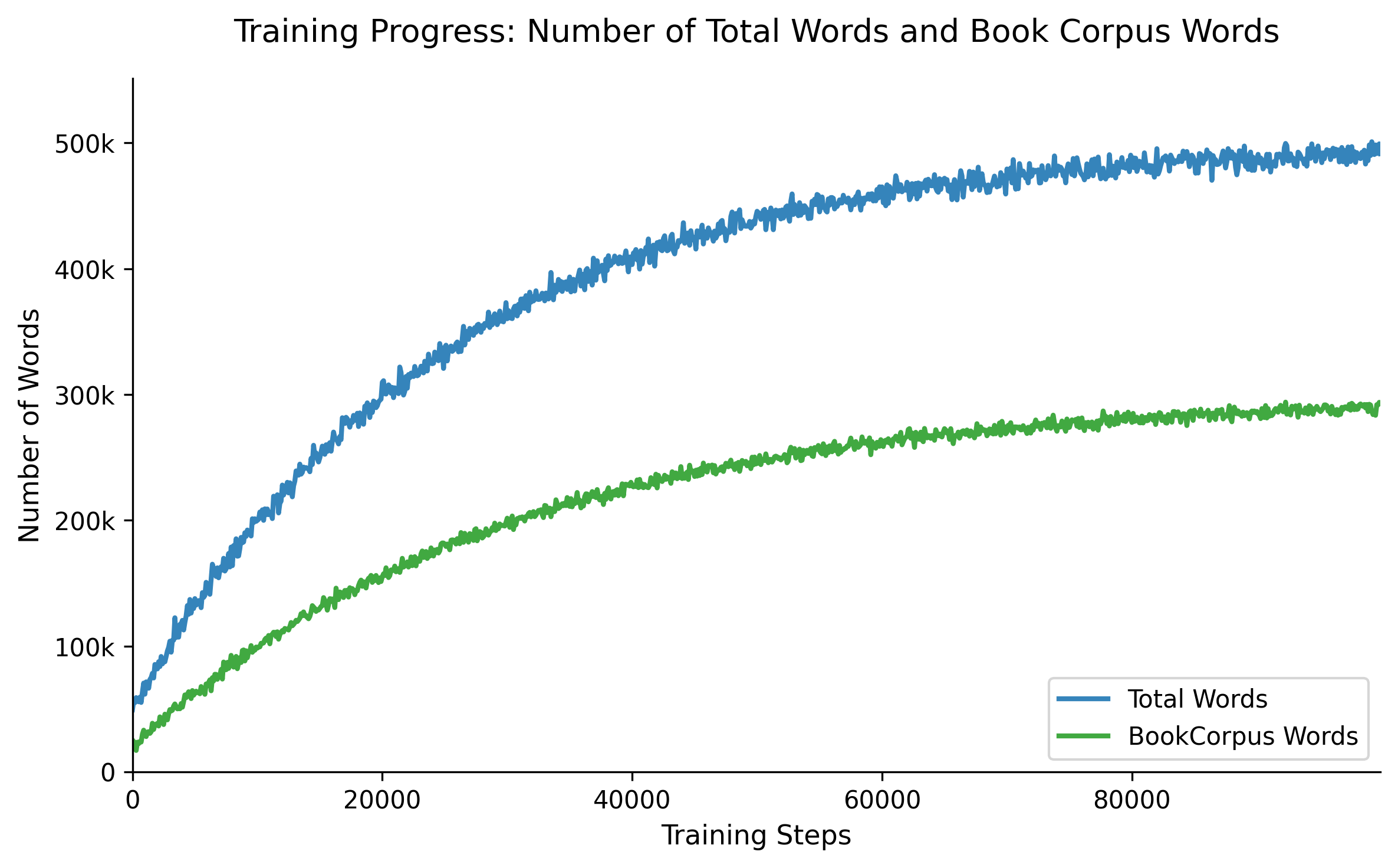
Training Progress: Number of Total Words and Book Corpus Words
The figure shows two line plots tracking the number of total words and 'bookcorpus' words accumulated over training time steps, helping visualize data composition and progression.
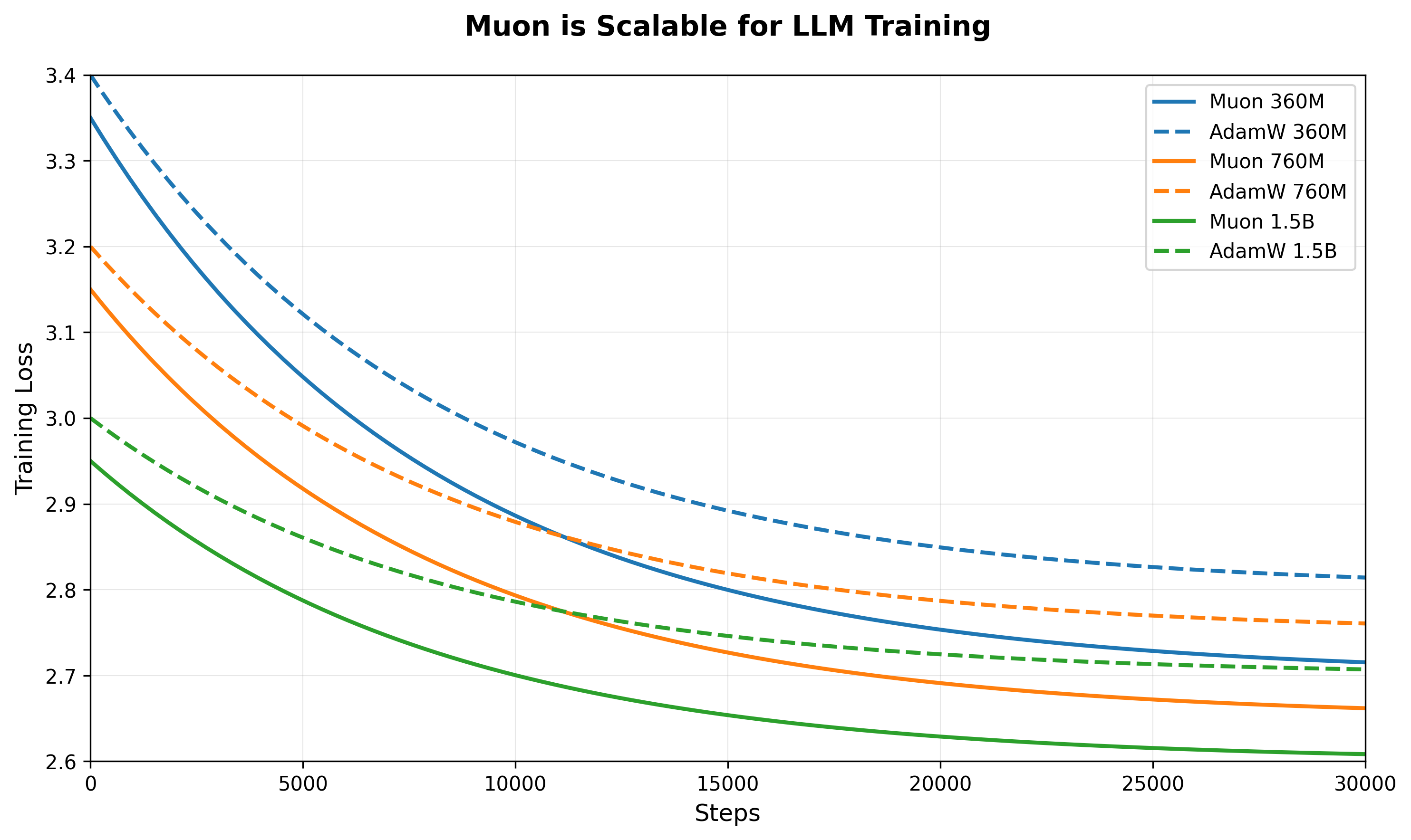
Muon is Scalable for LLM Training
The plot visualizes the scaling performance of Muon for large language model (LLM) training. It shows multiple lines comparing different batch sizes or methods against training throughput or speed, highlighting how Muon's throughput scales with batch size.
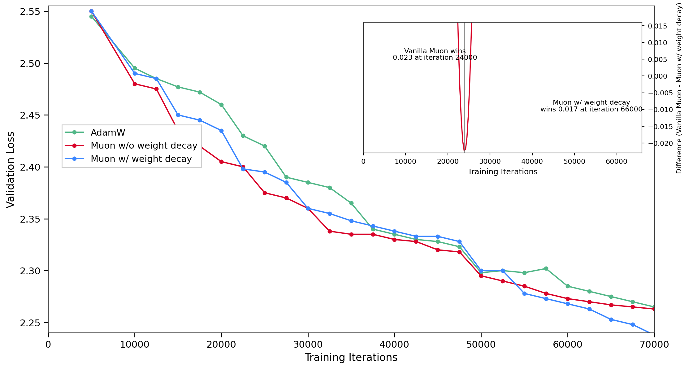
Validation Loss vs. Training Iterations
The main plot shows validation loss against training iterations for three models/conditions: AdamW optimizer, Muon without weight decay, and Muon with weight decay. Each model's loss decreases over iterations with Muon w/o weight decay having the lowest validation loss. The inset plot presents the difference in validation loss between Vanilla Muon and Muon with weight decay over training iterations, highlighting points where one outperforms the other with annotated iteration markers.
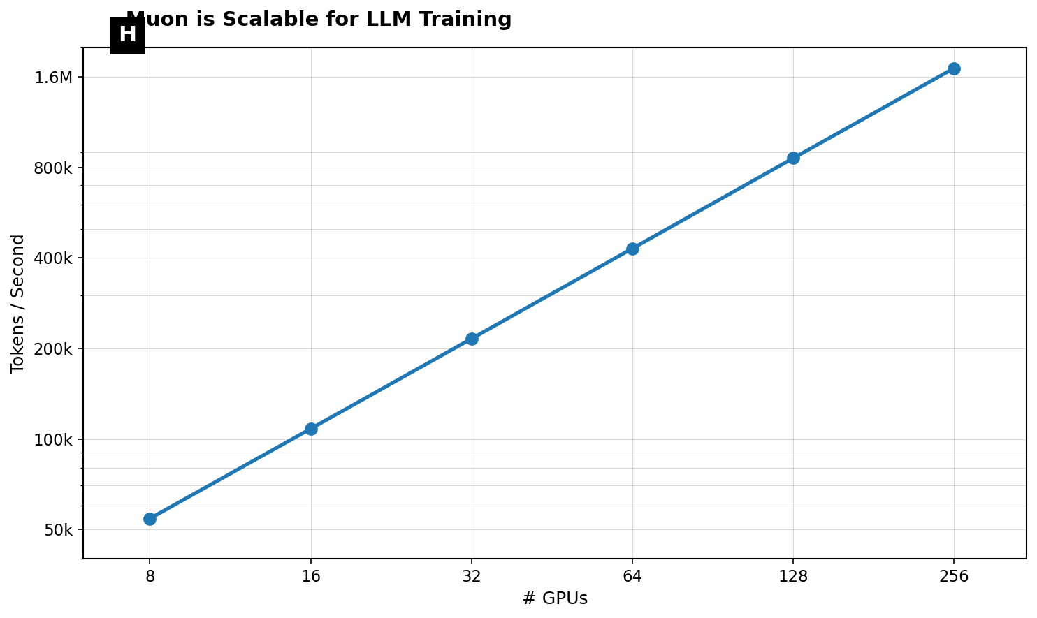
Muon is Scalable for LLM Training
This plot illustrates the cumulative number of tokens processed over training steps. It demonstrates a near linear scaling, indicating consistent token throughput during long-duration LLM training on a single TPUv4 device.
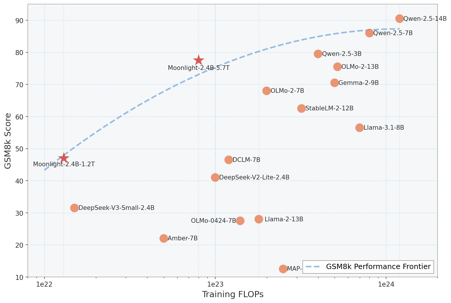
GSM8k Score vs Training FLOPs with Performance Frontier
This scatter plot visualizes various language models plotted by their training FLOPs on the x-axis and GSM8k score on the y-axis. Each point corresponds to a model variant, with two highlighted models marked as stars. A dashed line indicates the GSM8k Performance Frontier, connecting the best tradeoffs between compute used and performance achieved. Labels next to points identify the models. The shaded region under the frontier highlights the area of suboptimal performance vs compute.
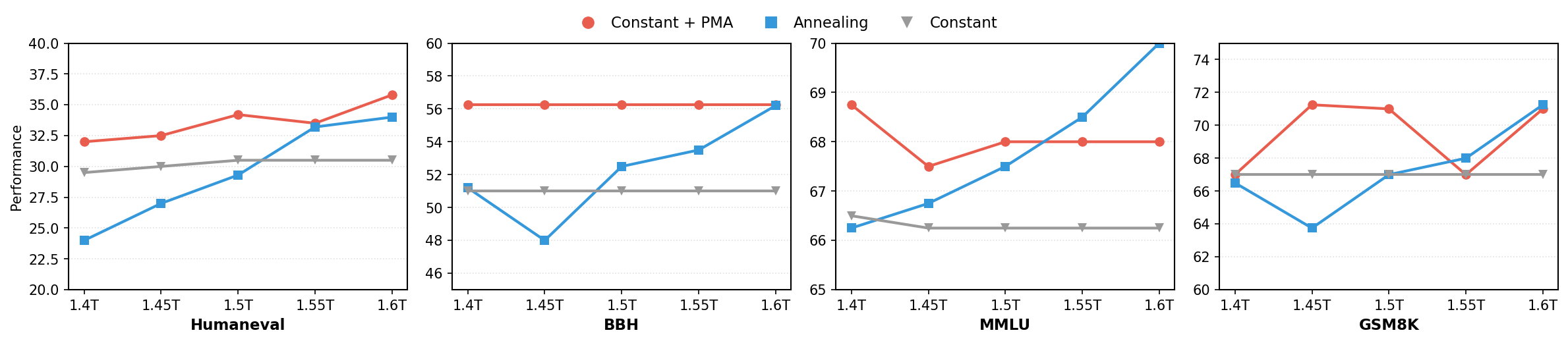
Performance Comparison Across Datasets
Four side-by-side line plots showing performance metrics for three different methods (Constant + PMA, Annealing, Constant) across different model scales (e.g., 1.4T to 1.6T) on four datasets (Humaneval, BBH, MMLU, GSM8K). Each subplot highlights how performance varies by method as the scale increases.
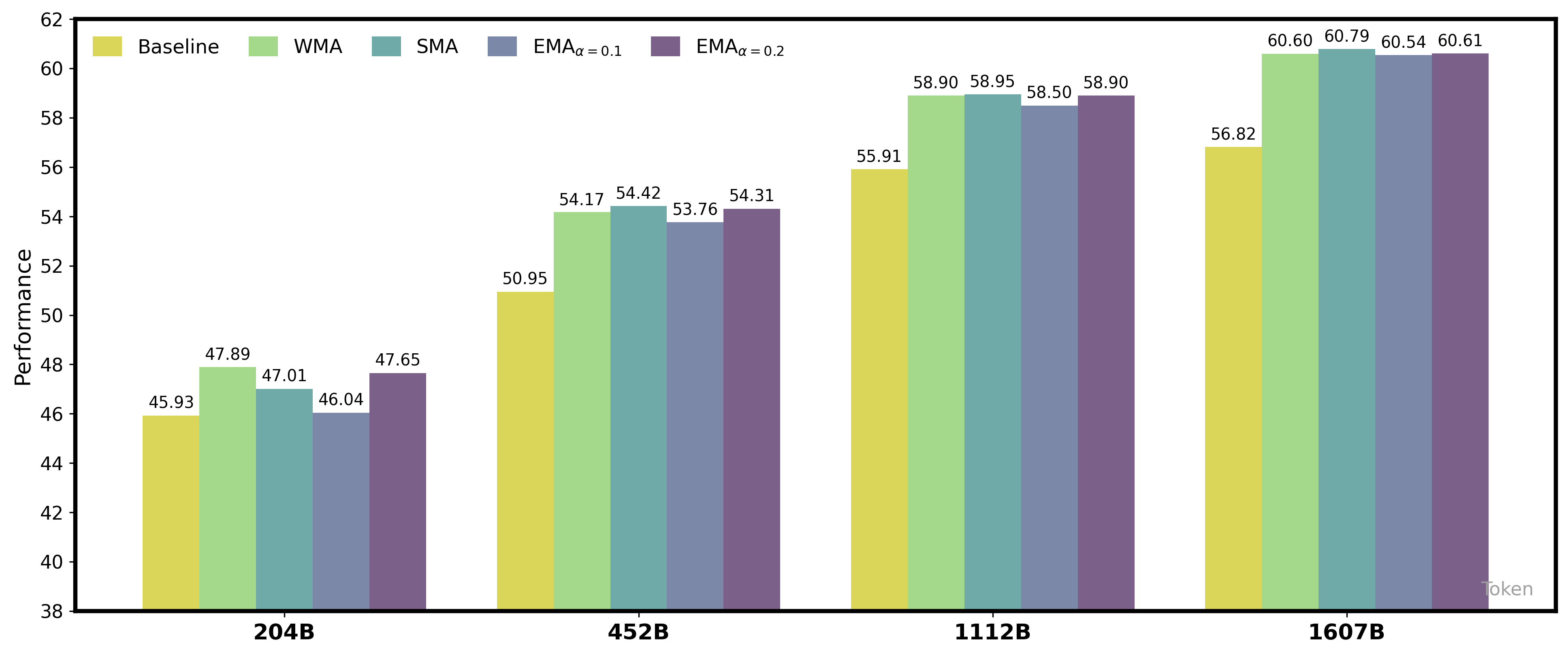
Performance Comparison of Different Smoothing Methods Across Model Sizes
The figure displays grouped bar charts comparing the performance metric across four different model sizes (204B, 452B, 1112B, 1607B tokens). Each group contains bars representing five methods: Baseline, WMA, SMA, EMA with alpha=0.1, and EMA with alpha=0.2. The performance values are shown numerically above each bar. The x-axis is labeled with model size (in billions of tokens), and the y-axis represents performance.
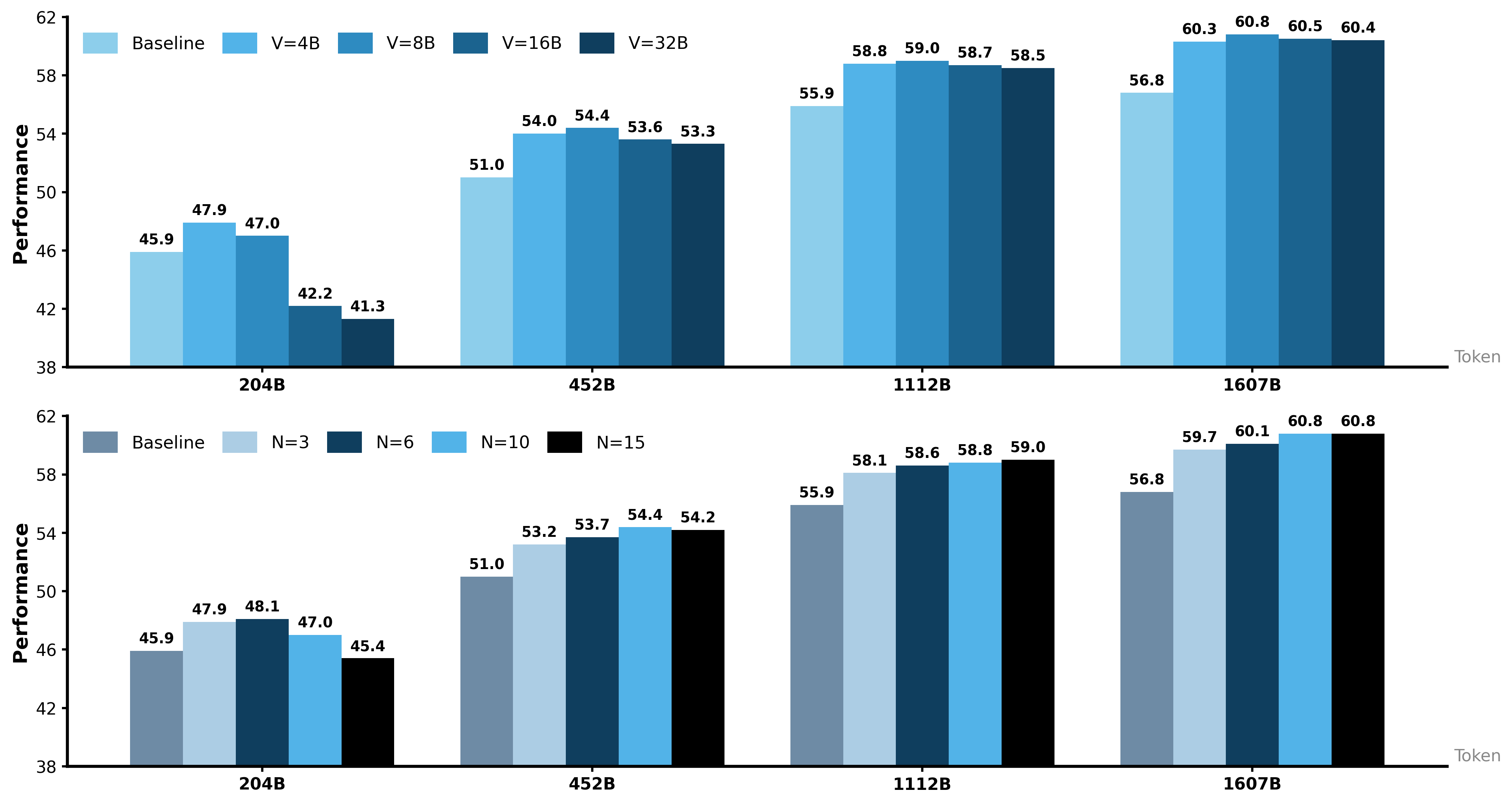
Performance vs Token with different settings
This figure consists of two vertically stacked bar chart subplots comparing the performance metric across four different token sizes (204B, 452B, 1112B, 1607B). Each subplot shows grouped bars representing different experimental conditions for performance — the top subplot compares varying values of V (4B to 32B) against a baseline, while the bottom subplot compares values of N (3 to 15) against the baseline. The common y-axis is performance, and the x-axis corresponds to token size. The bars are color-coded to illustrate the different variable settings in each subplot.
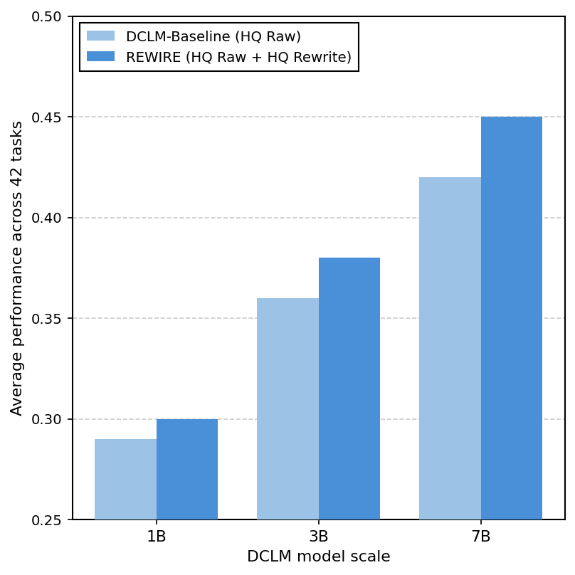
Average performance across 22 tasks vs DCLM model scale
This grouped bar chart compares the average performance across 22 tasks of two methods, DCLM-Baseline (HQ Raw) and REWIRE (HQ Raw + HQ Rewrite), over three model scales of DCLM (1B, 3B, 7B). The performance increases with model size and REWIRE consistently outperforms the baseline.
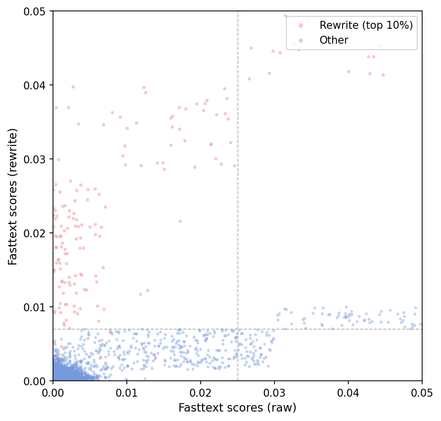
Fasttext scores (raw vs rewrite)
A scatter plot showing the distribution of Fasttext scores comparing original raw text scores versus rewritten text scores. The points are colored by category: red for top 10% rewrite scores, and blue for others. Two dashed vertical and horizontal lines indicate threshold cutoffs defining the top 10% rewrite points.
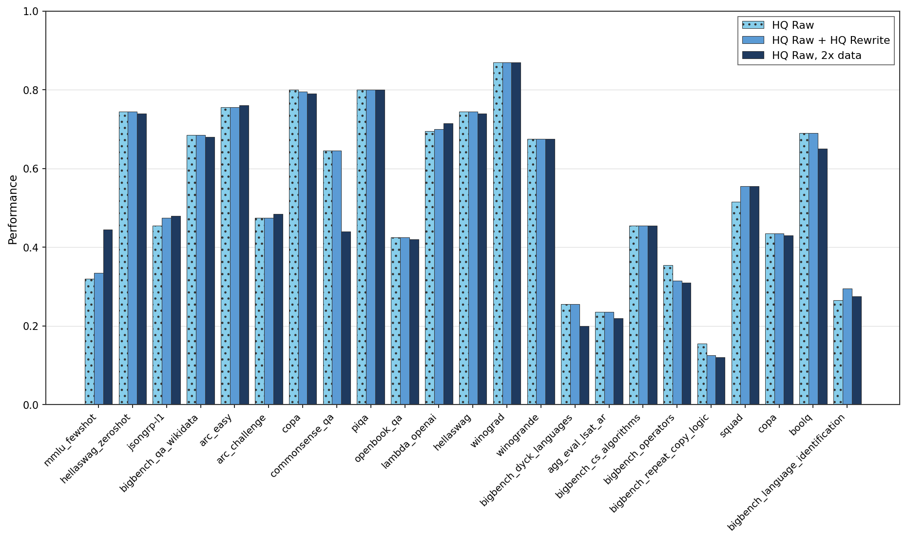
Performance Comparison Across Numerous Benchmarks
This figure displays grouped bar charts comparing the performance of three evaluation settings (HQ Raw, HQ Raw + HQ Rewrite, HQ Raw with 2x data) across around 24 different benchmarks or datasets. Performance values are shown on the y-axis, and the x-axis labels correspond to different benchmark dataset names. The grouping of bars indicates comparison across different data or approach variants per benchmark.
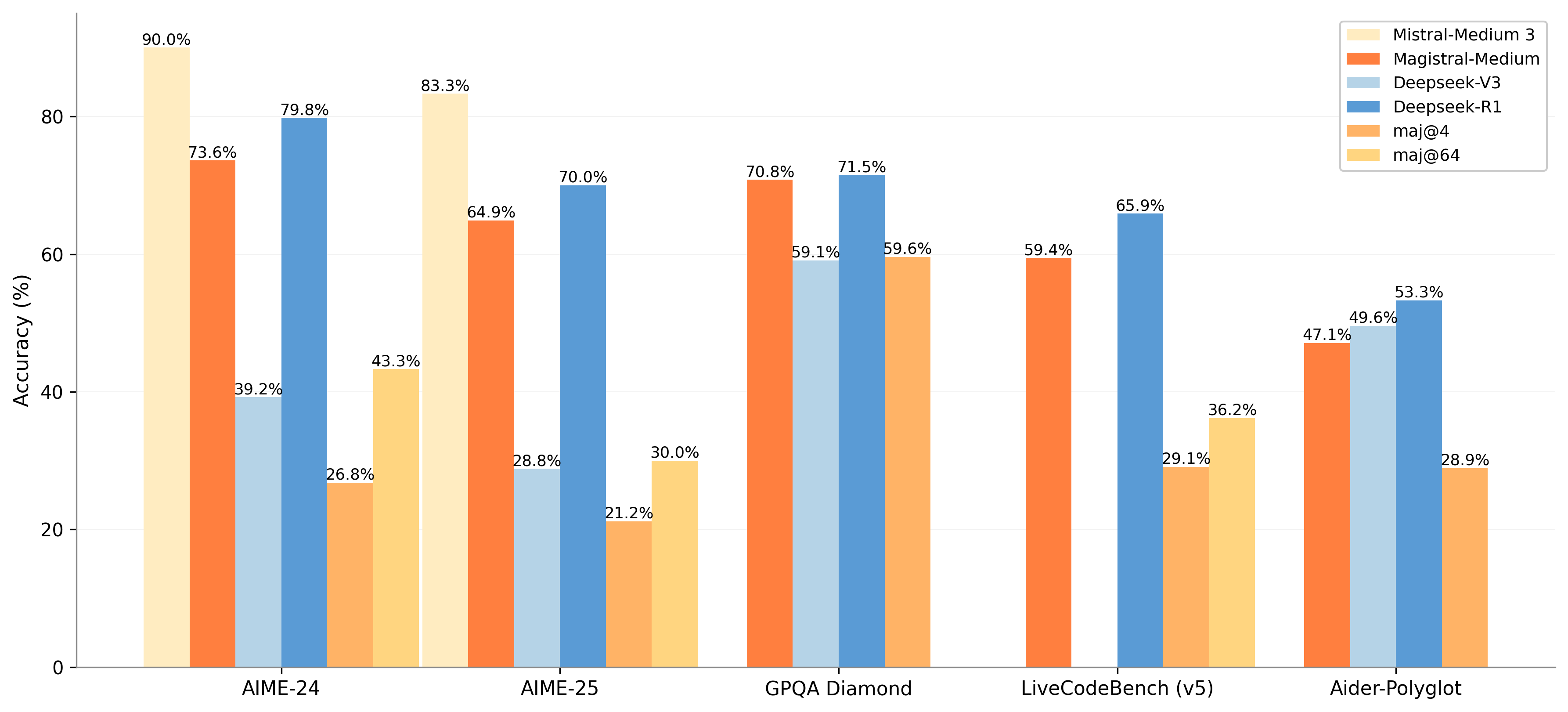
Accuracy Comparison Across Various Models and Datasets
The chart displays the accuracy percentages of different models and metrics across five datasets. It uses grouped bars to compare models: Mistral-Medium 3, Magistral-Medium, Deepseek-V3, and Deepseek-R1, alongside additional metrics maj@4 and maj@64 indicated by lighter shades stacked on some bars. The x-axis shows the datasets and the y-axis accuracy in percentage.
Accuracy Comparison Across Different Datasets
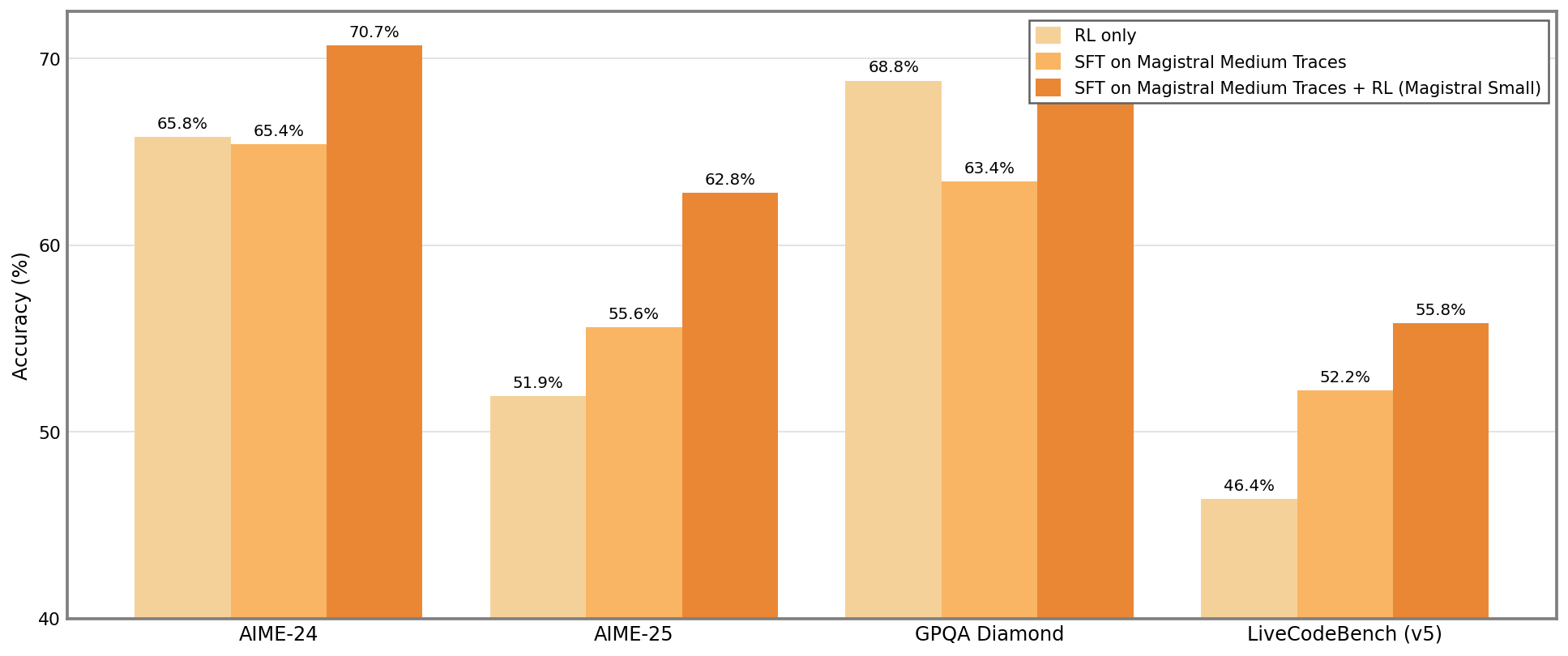
This grouped bar chart compares accuracy percentages across four datasets (AIME-24, AIME-25, GPQA Diamond, LiveCodeBench (v5)). For each dataset, three experimental conditions are reported: 'RL only', 'SFT on Magistral Medium Traces', and 'SFT on Magistral Medium Traces + RL (Magistral Small)'. Accuracy is plotted on the vertical axis as percentages, allowing easy comparison of the impact of different training strategies on model performance.
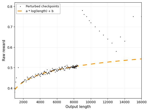
The figure presents a scatter plot of data points labeled as 'Perturbed checkpoints' plotting Raw reward against Output length. An orange dashed line shows a fitted function of the form a * log(length) + b, illustrating a modeled trend or fit to the data.
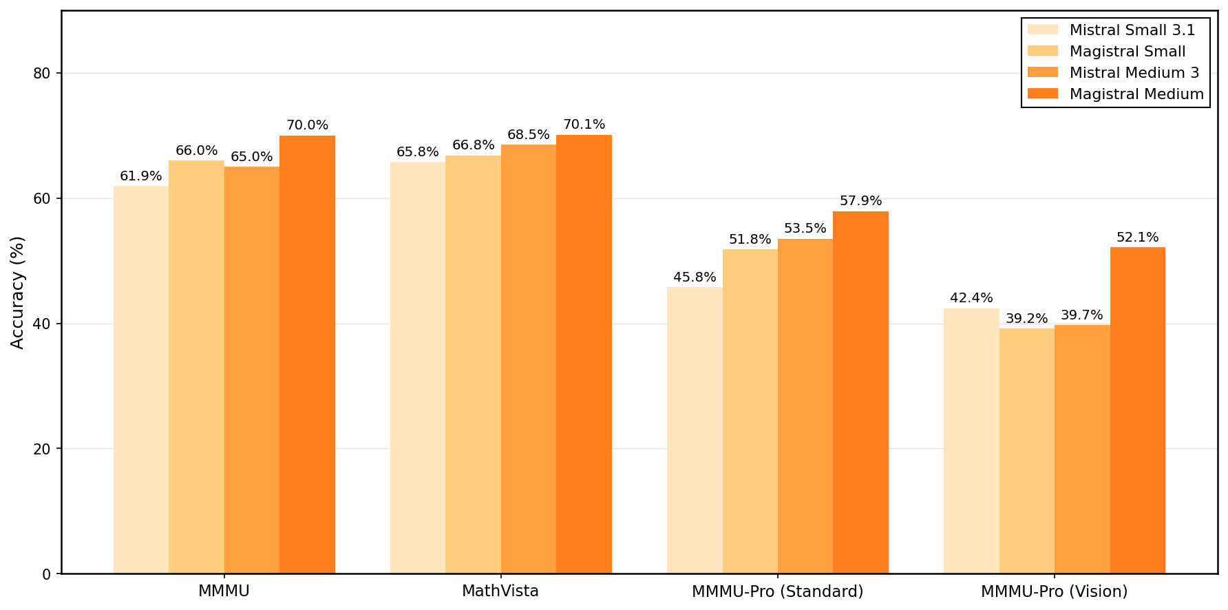
Grouped bar chart showing accuracy percentages for four model variants (Mistral Small 3.1, Magistral Small, Mistral Medium 3, Magistral Medium) evaluated on four dataset or task categories (MMMU, MathVista, MMMU-Pro Standard, MMMU-Pro Vision). Each group represents a dataset/task with bars comparing model variants.
Accuracy (%) on Different Datasets
A grouped bar chart comparing accuracy percentages of three models (Medium OSS-SFT, Medium OSS-SFT + RL, Deepseek R1) across five datasets (AIME-24, AIME-25, MATH, GPQA Diamond, LiveCodeBench v5). Each dataset has three bars representing the different models' performance.

Light Refraction at Boundaries of Three Media
The figure shows a schematic diagram of a beam of light passing from one medium (n1) to a second medium (n2) and then to a third medium (n3), with bent light paths at the interfaces. The diagram is used to analyze and conclude the relative speeds of light in each medium based on refraction behavior.
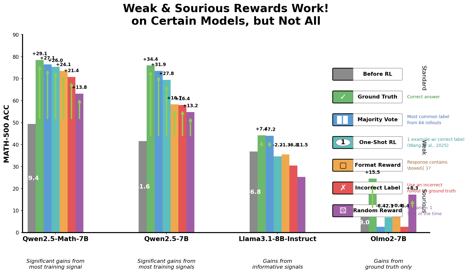
Weak & Spurious Rewards Work! on Certain Models, but Not All
A grouped bar chart comparing the accuracy (MATH-500 Acc.) of different models (Qwen2.5-Math-7B, Qwen2.5-7B, Llama3.1-8B-Instruct, Olmo2-7B) across various training reward conditions. Bars are color-coded according to different reward schemes including ground truth, majority vote, one-shot RL, format reward, incorrect label, and random reward. Performance gains or losses relative to a baseline are shown as numeric annotations above bars. The plot illustrates which reward types yield significant accuracy improvements on different models.
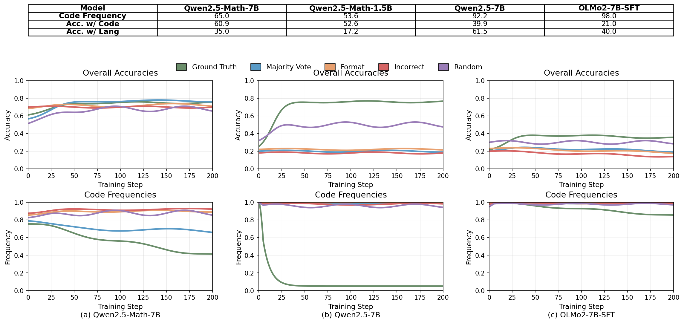
Overall Accuracies and Code Frequencies Across Models
A 2x3 grid visualizing training dynamics for three different models: Qwen2.5-Math-7B, Qwen2.5-7B, and OLMo2-7B-SFT. The top row contains 'Overall Accuracies' plots showing multiple accuracy-related curves over training steps, color-coded by Ground Truth, Majority Vote, Format, Incorrect, and Random. The bottom row shows 'Code Frequencies' plots with corresponding frequency curves over training steps for the same models. Each subplot tracks several metrics simultaneously, allowing detailed comparison of model performance and internal distributions during training.
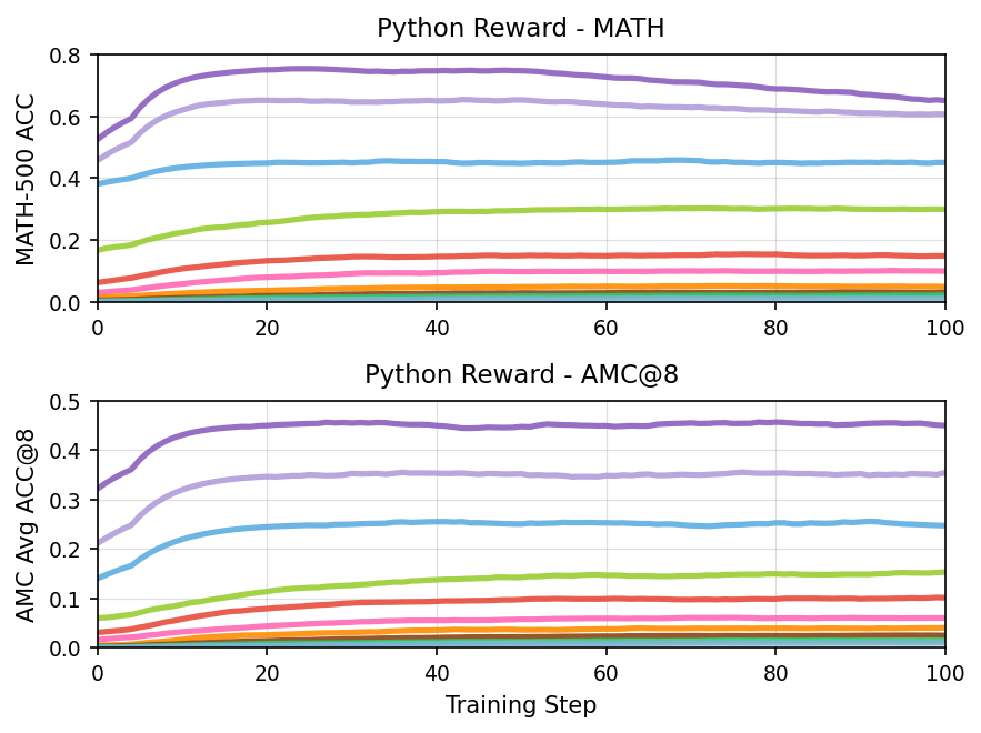
Python Reward - MATH and Python Reward - AMC@8
The figure consists of two line plots arranged vertically. The top plot shows the accuracy on the MATH-500 dataset plotted against training steps, while the bottom plot shows average accuracy on the AMC@8 metric against training steps. Each plot contains multiple lines indicating different experimental runs or models over the course of training.
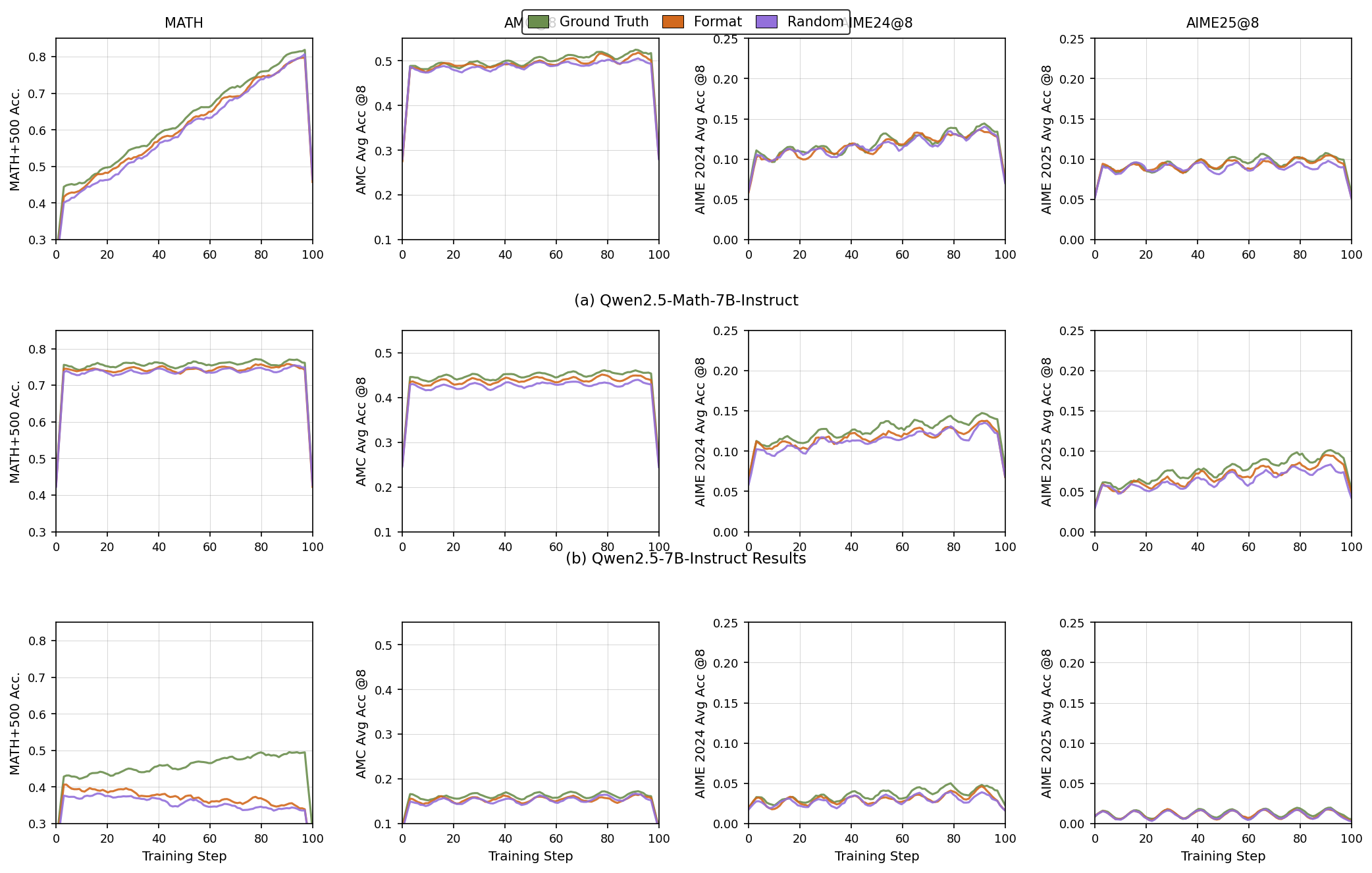
Training Performance Metrics Across Steps for Different Models and Datasets
The figure is composed of 12 line plots arranged in three rows and four columns. Each row corresponds to results for a different model variant or experiment condition (e.g., Qwen2.5-Math-7B-Instruct, Qwen2.5-7B-Instruct Results). Each column corresponds to a different dataset or metric (e.g., MATH, AMC@8, AIME24@8, AIME25@8). Within each plot, three different conditions or baselines (Ground Truth, Format, Random) are tracked by lines over training steps. The y-axis shows accuracy metrics specific to each dataset/type, while the x-axis shows training steps from 0 to 100.
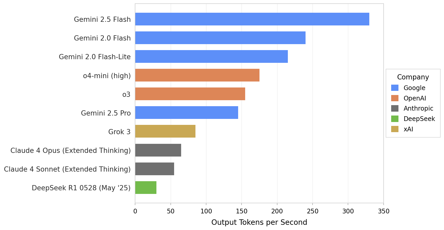
Output Tokens per Second by Model
This horizontal bar chart visualizes output tokens per second for multiple models from different companies, allowing comparison of their throughput performance. Each bar represents a model, colored by company for differentiation.
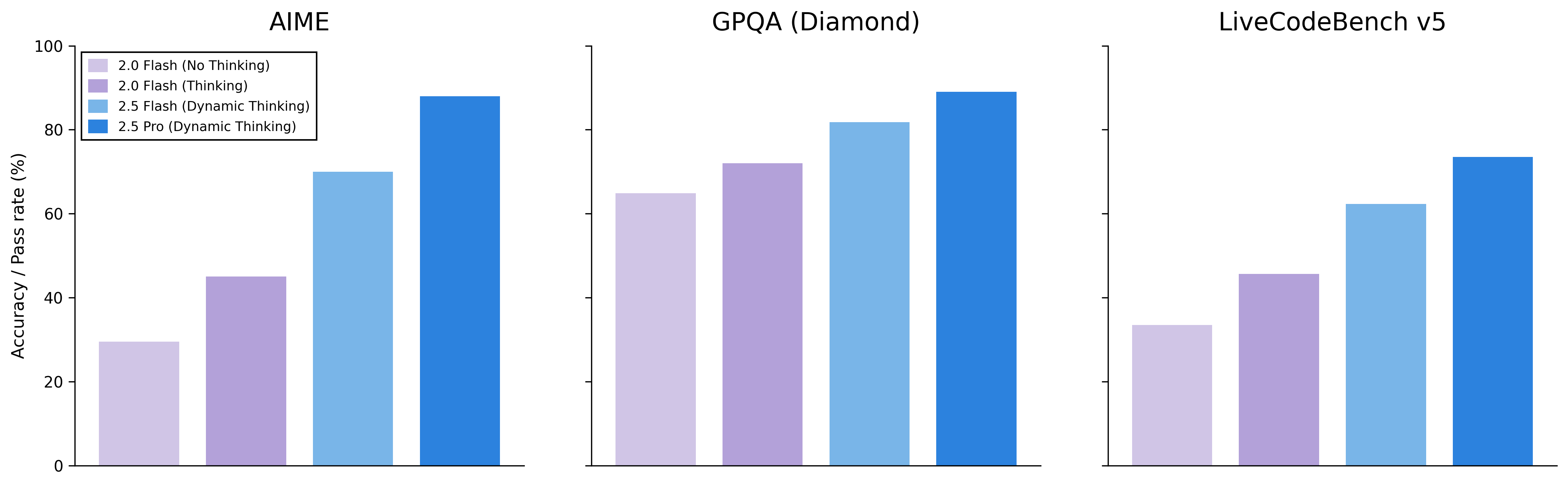
Accuracy / Pass rate (%) Comparison
The figure presents three side-by-side grouped bar charts comparing accuracy or pass rate percentages across four configurations (2.0 Flash No Thinking, 2.0 Flash Thinking, 2.5 Flash Dynamic Thinking, 2.5 Pro Dynamic Thinking) for three different datasets or benchmarks: AIME, GPQA (Diamond), and LiveCodeBench v5. Each subplot shows performance bars colored in shades of purple to blue for these configurations.
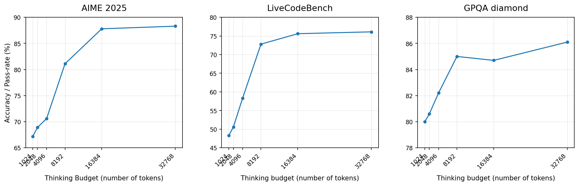
Performance across Thinking Budgets on Different Benchmarks
The figure shows three separate line plots arranged horizontally. Each plot indicates the performance (accuracy or pass rate %) of a model across varying thinking budgets measured by number of tokens. The three datasets or evaluation tasks are labeled 'AIME 2025', 'LiveCodeBench', and 'GPQA diamond'. Each plot traces improvement in performance as the thinking budget increases, illustrating scaling effects on different benchmarks.
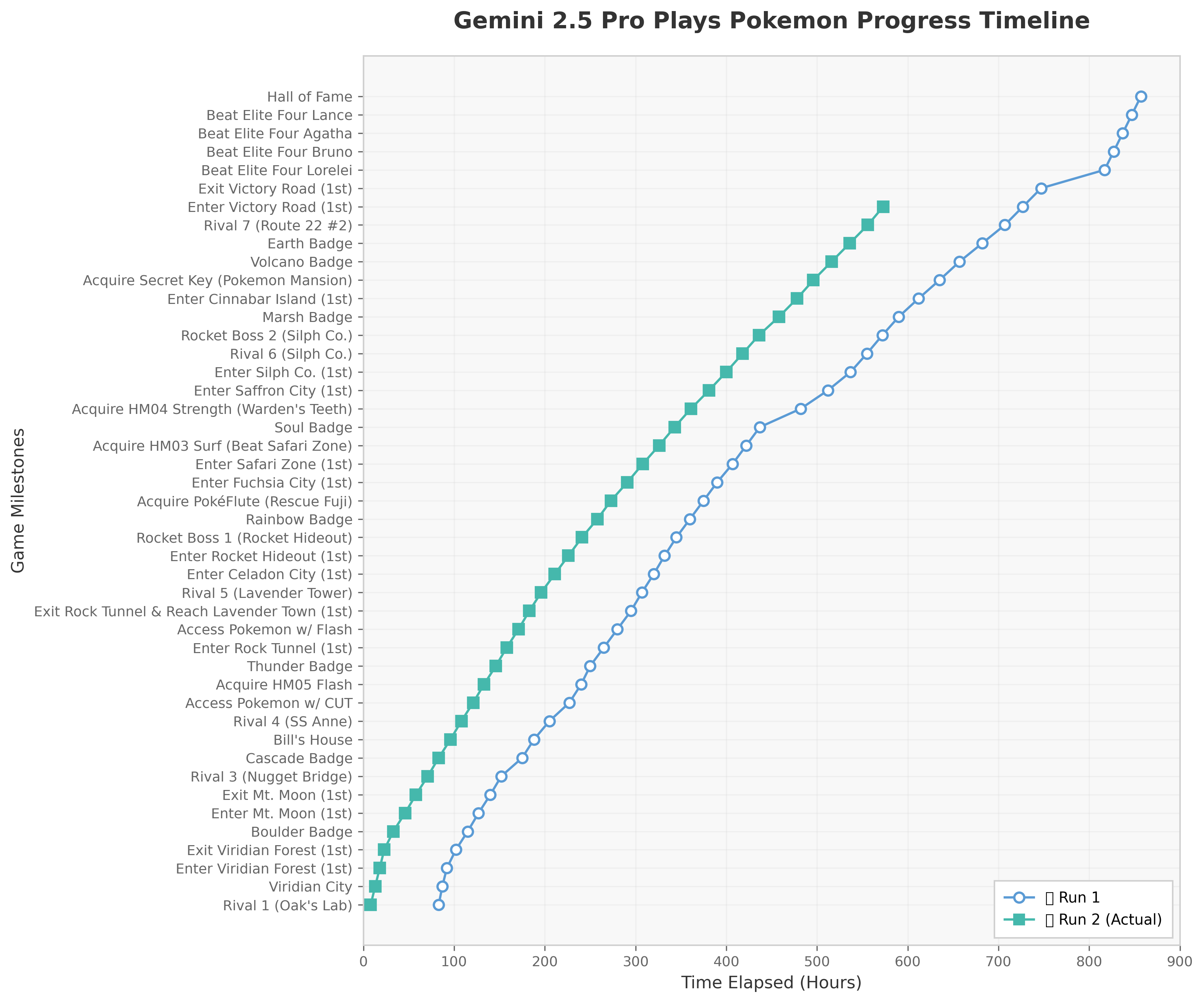
Gemini 2.5 Pro Plays Pokemon Progress Timeline
This figure shows two progress timelines (Run 1 and Run 2) of the Gemini 2.5 Pro system playing Pokemon. The x-axis represents the time elapsed in hours, and the y-axis enumerates numerous game milestones in a descending order. Each line traces the completion of these milestones over time, enabling comparison of progress speed and milestones reached in two separate runs.
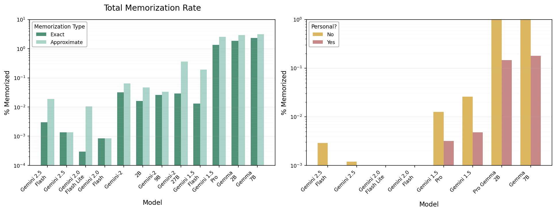
Total Memorization Rate
The figure shows two bar charts side by side comparing different models on memorization rates. The left plot compares exact versus approximate memorization rate percentages for a series of models. The right plot shows the percentage memorized broken down by whether the data is personal or not for the same models.
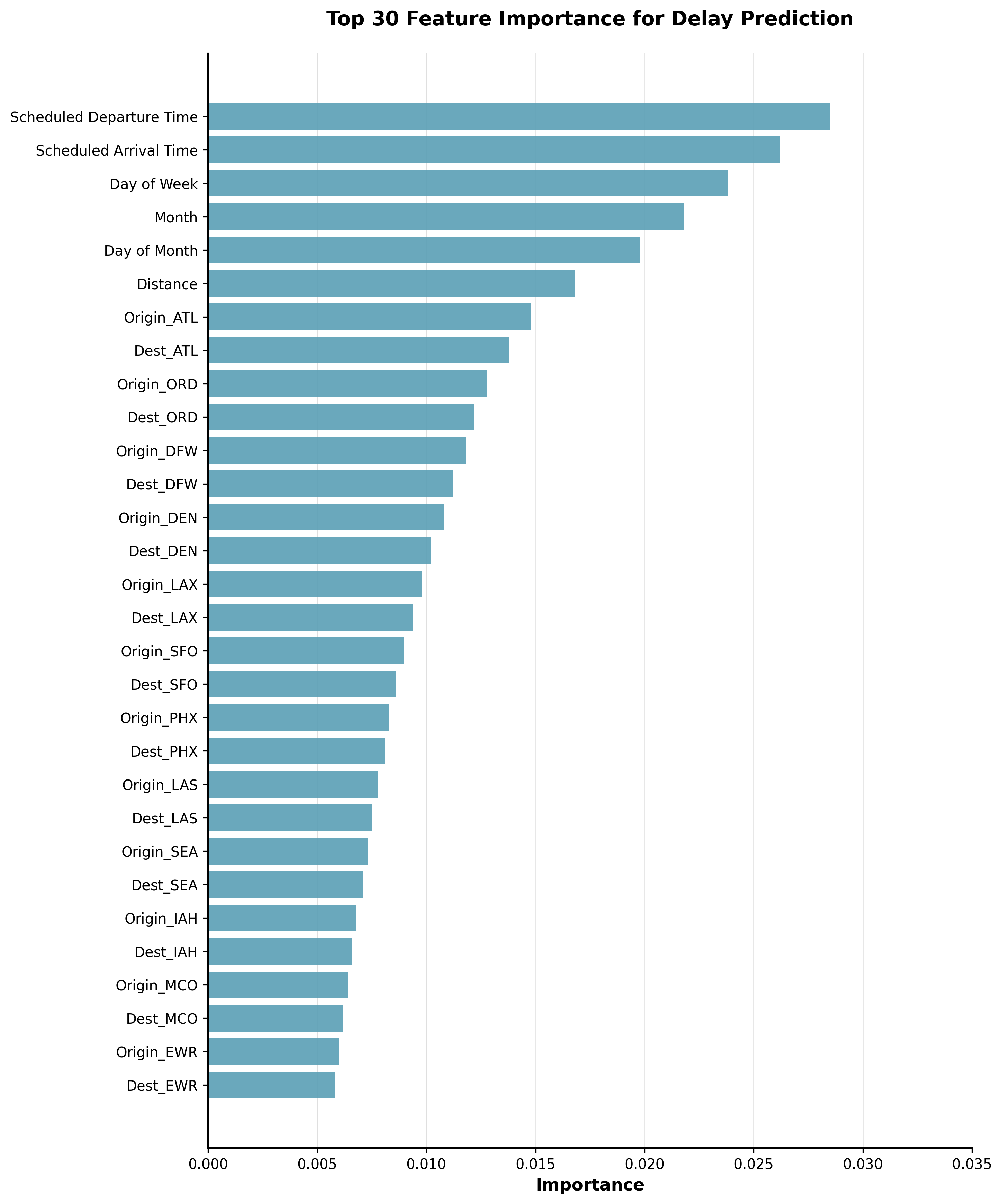
Top 30 features important for predicting delay
This figure presents the importance of the top 30 features for predicting train delays. It includes distribution plots showing feature value distributions for on-time and delay samples, a line plot visualizing the aggregation of feature importances, and a bar chart summarizing overall importances for sub-feature groups.
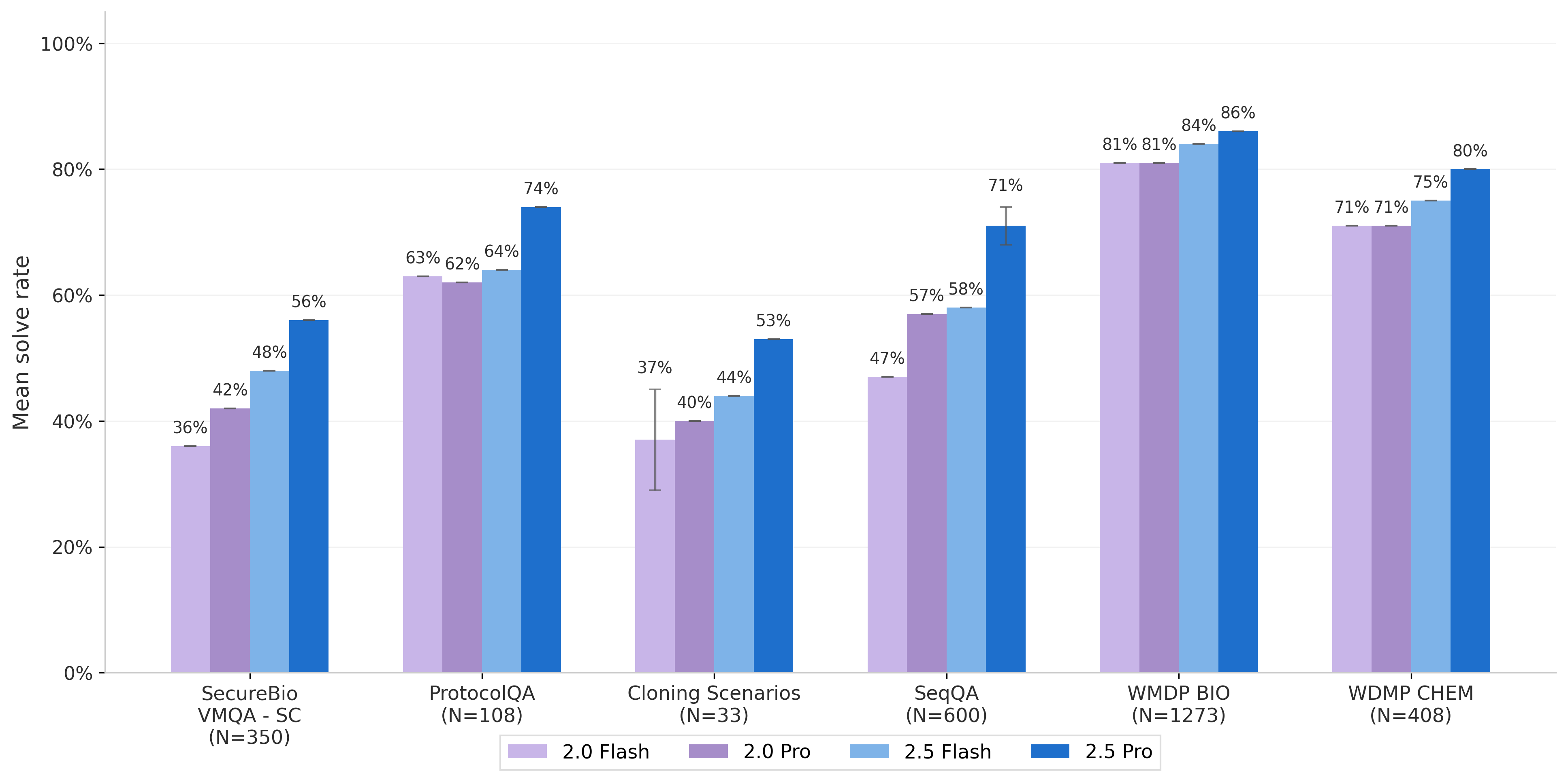
Mean solve rate comparison across datasets and models
The bar chart shows mean solve rates for different datasets (SecureBio VMQA-SC, ProtocolQA, Cloning Scenarios, SeqQA, WMDP BIO, WMDP CHEM) with four model variants (2.0 Flash, 2.0 Pro, 2.5 Flash, 2.5 Pro) represented as grouped bars for each dataset. Exact percentages are annotated on top of each bar.
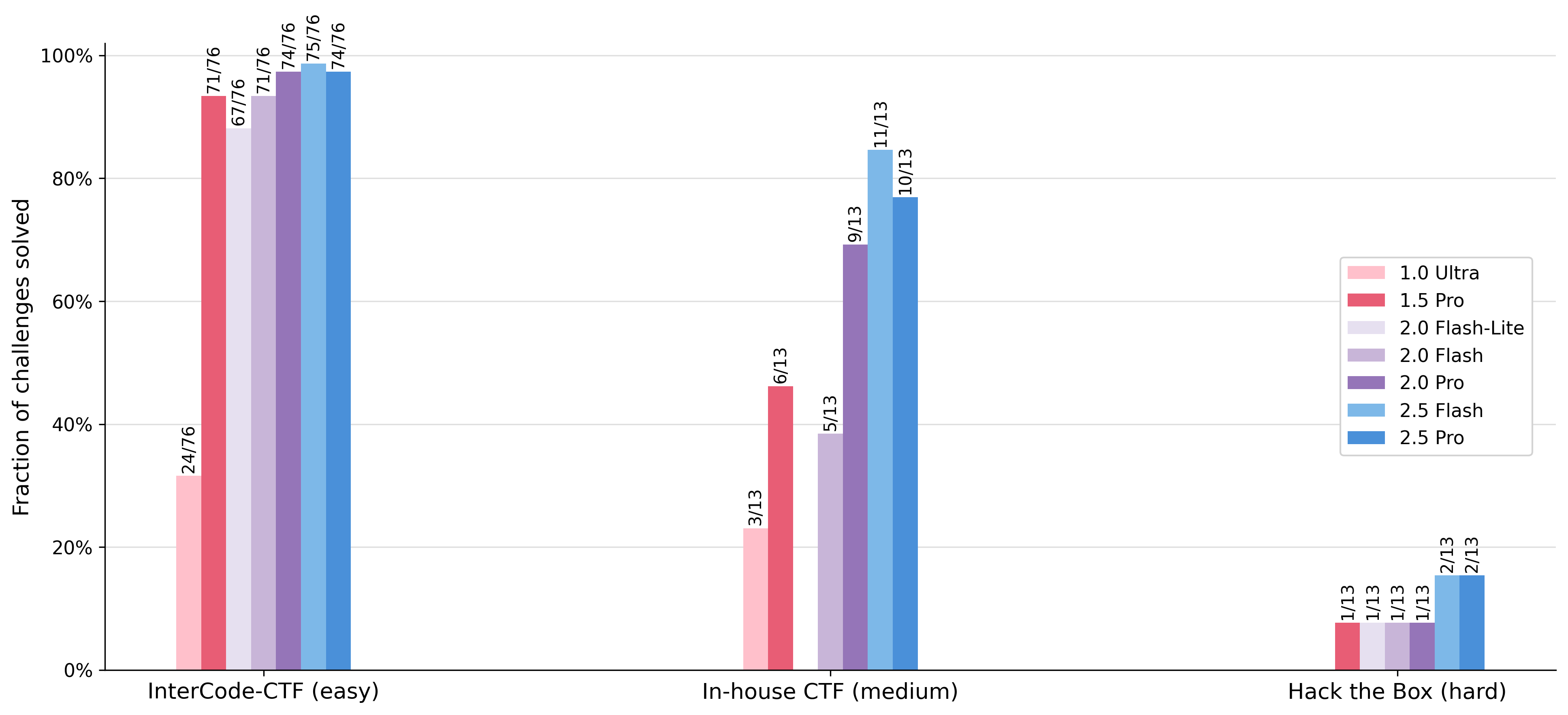
Fraction of challenges solved by different models across three datasets
This grouped bar chart shows the fraction of challenges solved (performance) for various models (e.g., 2.5 Pro, 2.0 Flash, 1.5 Pro) tested on three different challenge sets, labeled as InterCode-CTF (easy), In-house CTF (medium), and Hack the Box (hard). Each group on the x-axis corresponds to a challenge set, and multiple bars within each group represent different models. Values above bars represent the number of challenges solved over total challenges.
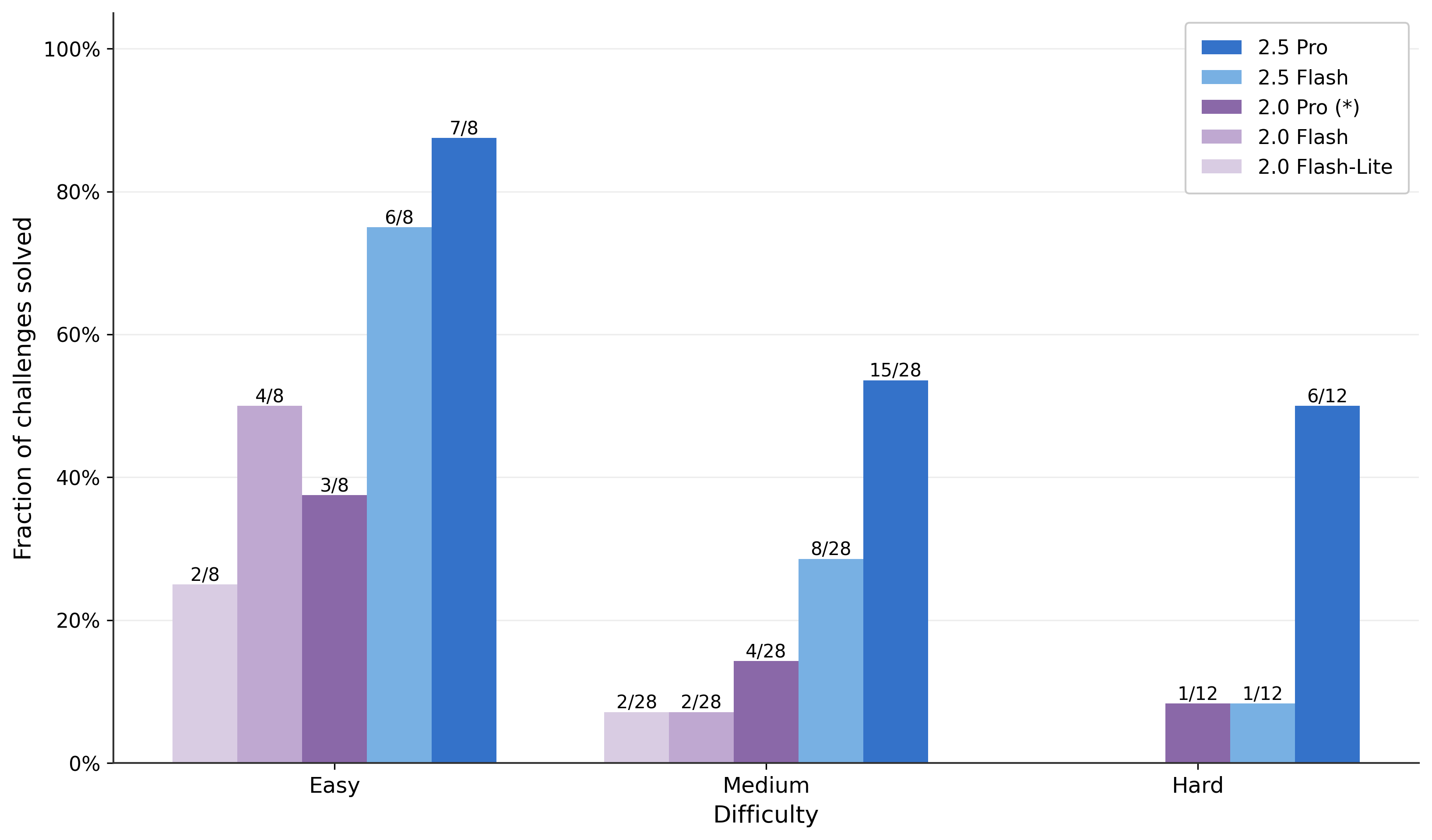
Fraction of challenges solved
A grouped bar chart comparing the fraction of challenges solved at different difficulty levels (Easy, Medium, Hard) for five different model variants. The x-axis represents difficulty categories, and the y-axis the fraction solved. Individual bars represent different model versions as indicated in the legend.
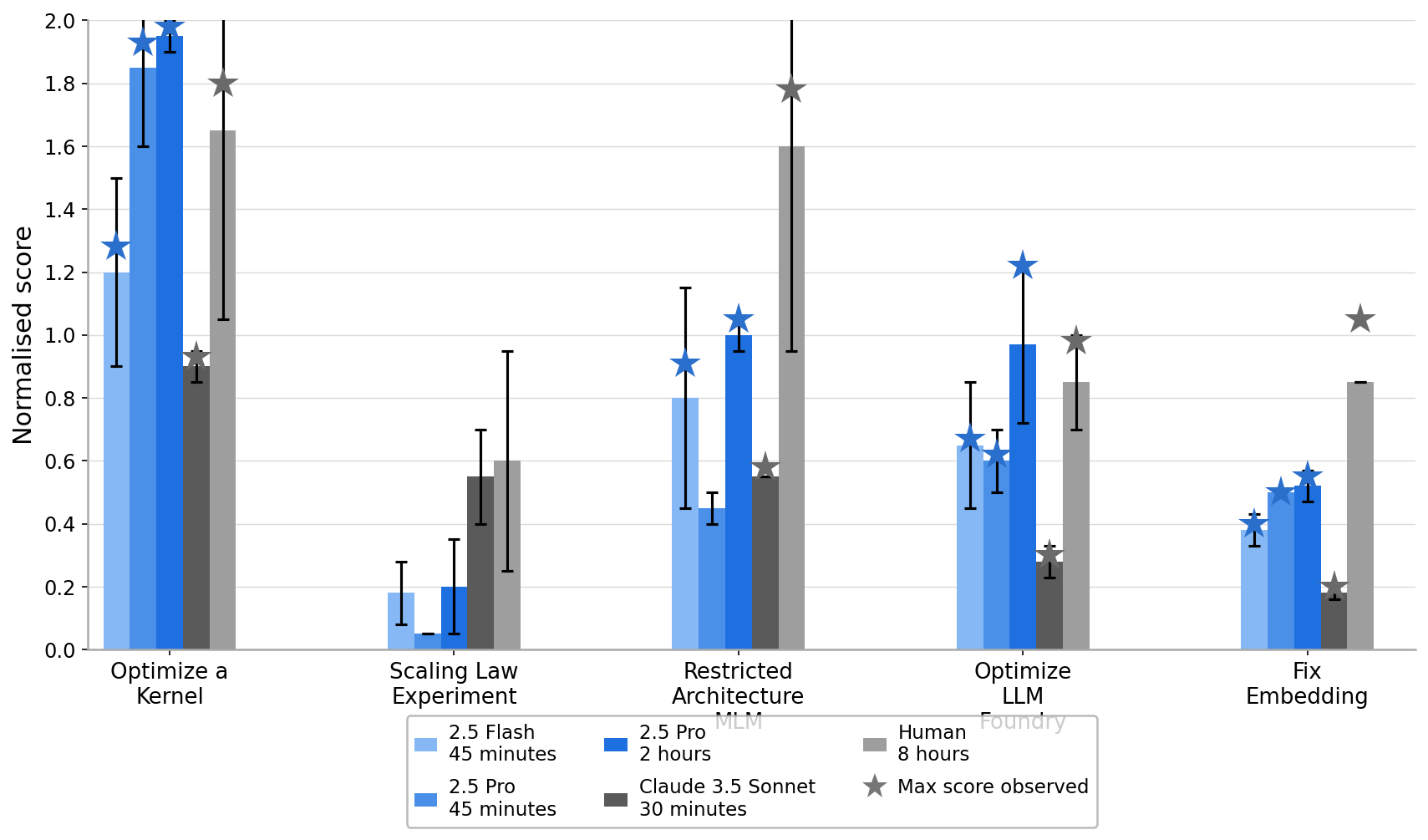
Normalized Score Comparison Across Different Experiments
The visualization shows normalized scores for different experimental conditions labeled on the x-axis: 'Optimize a Kernel', 'Scaling Law Experiment', 'Restricted Architecture MLM', 'Optimize LLM Foundry', and 'Fix Embedding'. Different bars in each group represent performance of various models or configurations (2.5 Flash, 2.5 Pro with different time budgets, Claude 3.5 Sonnet, Human) with error bars. Star markers overlay some bars indicating the max score observed for that condition.
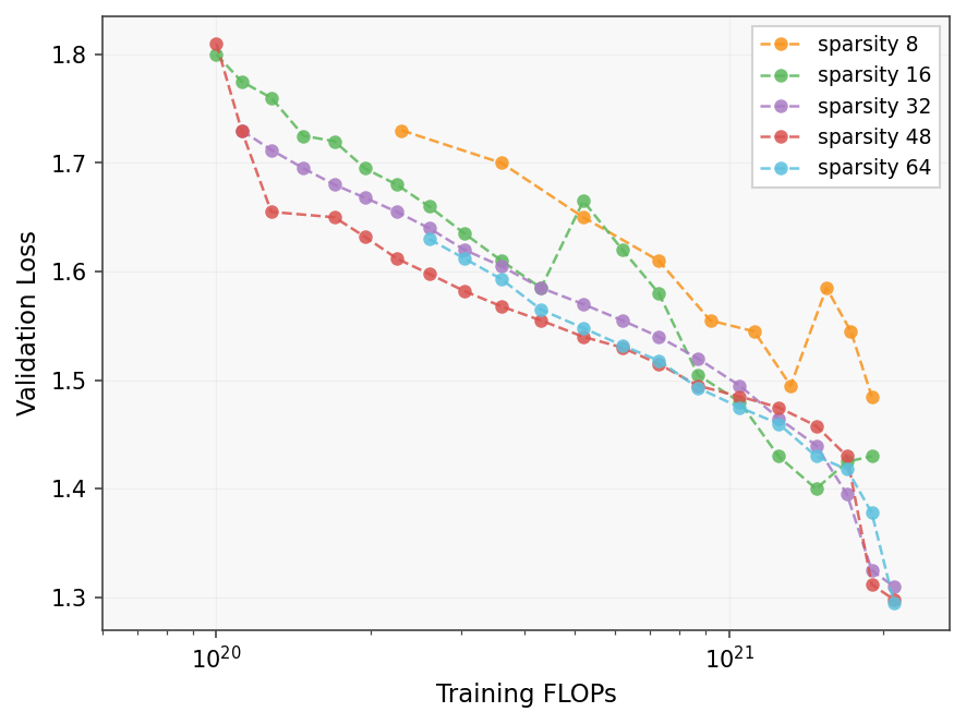
Validation Loss vs Training FLOPs for Different Sparsity Levels
A plot showing the validation loss as a function of training FLOPs for various sparsity levels (8, 16, 32, 48, 64). Each sparsity level is shown as a separate line with circular scatter points marking data measurements, connected by dashed lines. Red stars highlight a specific subset of points along each line, likely significant points such as checkpoints or minima. The x-axis has a log scale for FLOPs and the y-axis shows validation loss decreasing generally with more FLOPs.
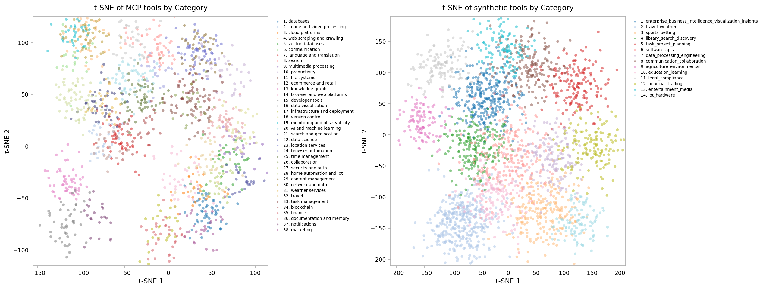
t-SNE of MCP tools by Category / t-SNE of synthetic tools by Category
This figure shows two side-by-side t-SNE scatter plots visualizing tool embeddings categorized by different types. The left plot visualizes MCP tool categories, while the right plot shows synthetic tool categories. Each point represents a tool, colored by category, revealing clustering patterns in the embedding space.
Ablation Study on Different Datasets and Ablation Types
This figure displays the results of ablation studies across six benchmark datasets (IMDB, Yelp, Amazon, Amazon-5, Amazon-10, Clothing, Home, Sports) using four ablation types (TopK, Random, Shuffle, RandFeat.) for varying ablation percentages (10%, 20%, 30%, 40%, 50%). It illustrates how the model accuracy degrades as larger portions of features are ablated, allowing comparison of ablation impacts by method and dataset.
Training losses on multiple datasets over iterations
The image shows four line plots arranged horizontally, each representing training loss curves on a different dataset (CIFAR-10, CIFAR-100, ImageNet, and CIFAR-10.1). Each plot presents multiple lines of loss values decreasing over training iterations, illustrating the model's convergence behavior on each dataset separately.
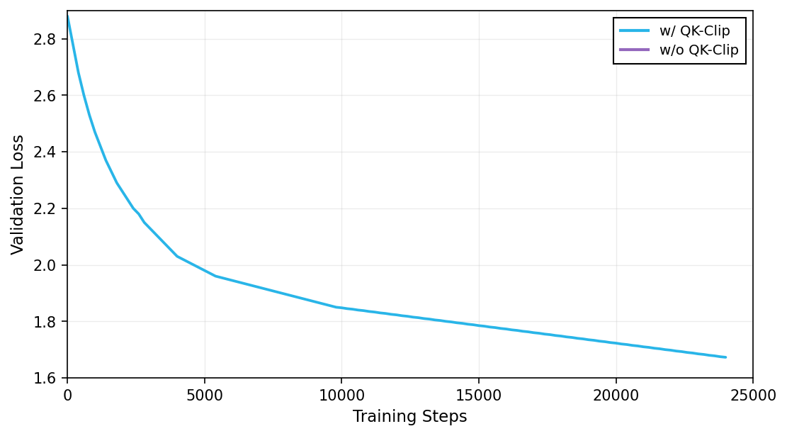
Validation Loss over Training Steps
The plot shows validation loss on the y-axis as a function of training steps on the x-axis for two conditions: with QK-Clip and without QK-Clip. It compares how the validation loss decreases during training for the two different settings.
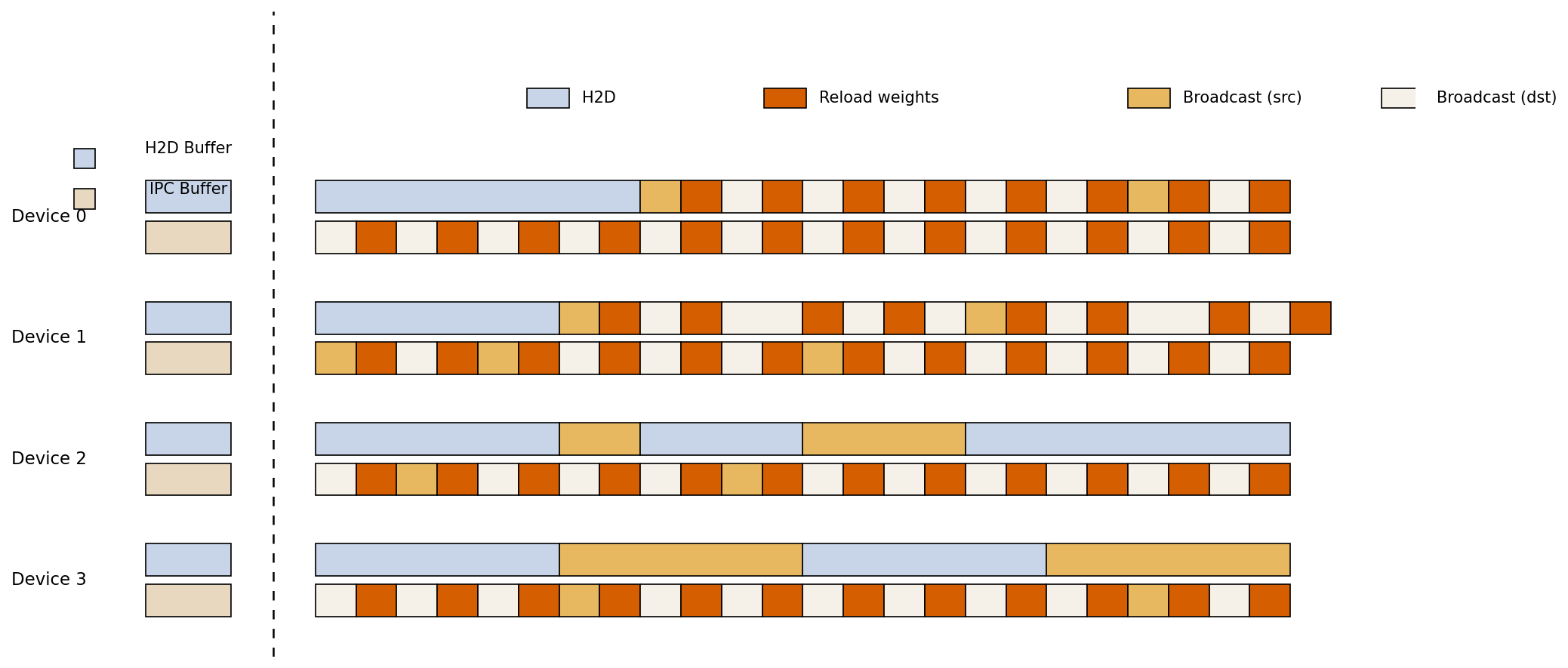
Inferred: Timeline Visualization of Device Memory and IPC Operations
This visualization depicts a timeline-like schedule of operations across four devices (Device 0 to Device 3) and two buffer types (H2D Buffer, IPC Buffer). Colored blocks represent different types of memory and communication activity including H2D transfers, Broadcast source/destination, and Reload weight operations. The dashed vertical line likely separates initial buffer definitions from time-ordered activities.
Performance Comparison across Multiple Datasets
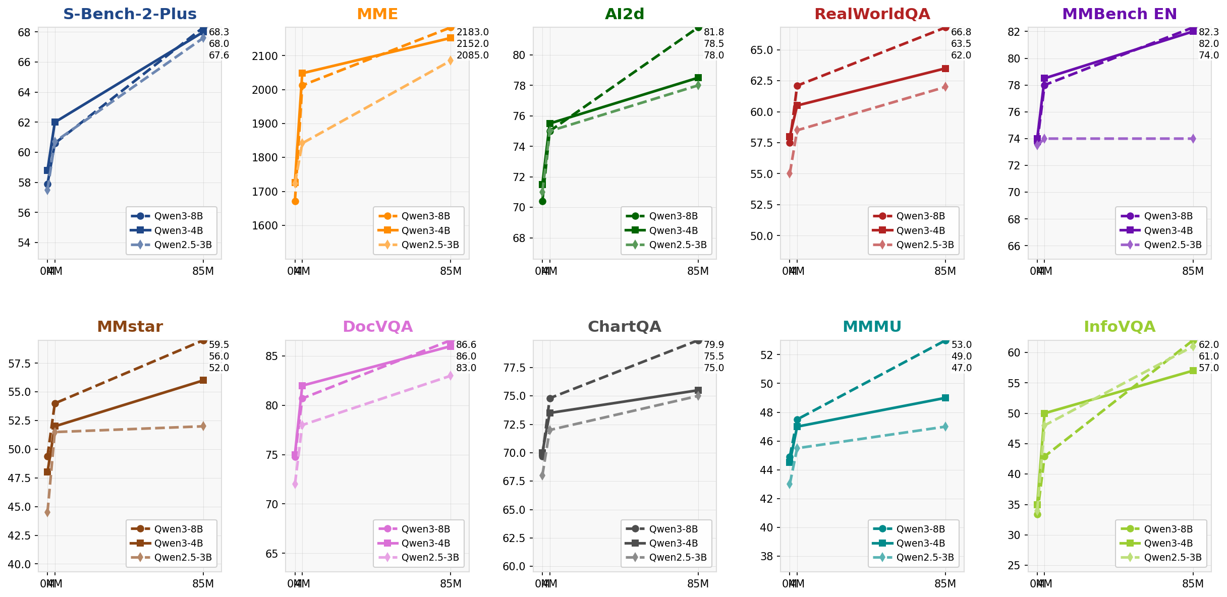
A 2x6 grid of multi-line plots each representing accuracy or performance metrics on different datasets/tasks. Each subplot compares three model variants (Qwen2.5-3B, Qwen3-4B, Qwen3-8B) over three training steps (0M, 4M, 85M). Colors and line styles differentiate the models, providing a benchmark of how model size and training steps affect performance.